Cayu
Redesigning an AI Platform, Using the AI Platform
Cayu is an AI-powered agentic software development platform that lets non-technical founders and developers build production-ready applications through natural language. I was brought on to redesign both the public-facing landing page and the authenticated product experience.
I used Cayu's own platform to design and build the redesign — prompt-driven development from the inside — with end-to-end ownership of research, competitive analysis, wireframing, visual design, and implementation.
Solo UX Designer
Cayu AI
1 month · 2025
The Problem
Cayu had a working product but a broken first impression. The platform enables users to describe what they want to build and have AI handle the architecture, design, and code — a powerful capability in an increasingly crowded space alongside Lovable, Bolt, Replit, and Cursor. But three interconnected problems were undermining growth.
The landing page didn't communicate what made Cayu different from the growing list of AI development tools. Visitors couldn't quickly understand who the product was for, what it did, or why they should choose it over alternatives. Without a clear narrative or visual hierarchy guiding users toward action, the page wasn't converting visitors into sign-ups. The messaging was generic, the layout lacked structure, and there was no compelling reason to take the next step. Once users did sign up, the product interface made it difficult to orient, discover features, or build momentum. The dashboard lacked clear pathways, and navigation didn't support the mental models users brought from competing tools.
The challenge wasn't just visual polish — it was a strategic communication problem. Cayu needed to tell a coherent story from the first landing page visit through the first successful project build.
Research & Discovery
User Research
I conducted interviews with two distinct user groups: non-technical founders exploring AI development tools for the first time, and developers evaluating Cayu alongside their existing workflows.
Non-technical users struggled to understand what "agentic" meant in practice. They wanted to see concrete examples of what could be built, not abstract descriptions of the technology. Developer users were evaluating Cayu against tools they already knew. They wanted to understand the platform's technical boundaries before investing time in onboarding. Both groups reported feeling lost after signing up — the transition from landing page promise to product reality felt abrupt, with no clear guidance on where to start.
Competitive Analysis
I analyzed four direct competitors — Lovable, Bolt, Replit, and Cursor — focusing on how each communicated their value proposition and structured their onboarding experience.
Lovable led with immediacy — a single prompt field front and center, removing friction between intent and action. Cursor positioned itself clearly for developers, with no ambiguity about its audience. Bolt and Replit both used live demos and example projects to show, rather than tell, what was possible.
Where I saw opportunity for Cayu: most competitors defaulted to similar messaging patterns. There was room to differentiate through specificity — showing the depth of what Cayu's agentic approach actually produces. Authenticated experiences across the board were workspace-first, dropping users into an empty canvas. None did a strong job of progressive onboarding. Visual identity was an underexploited differentiator — most platforms looked interchangeable.
Design Process
Designing with the product I was designing for
I made a deliberate choice to use Cayu itself as my primary build tool. Rather than working exclusively in Figma and handing off static mockups, I designed directly inside the platform — writing prompts, iterating on outputs, and refining the interface through the same AI-assisted workflow that Cayu's users would experience.
This wasn't just a process decision — it was a research method. Building with the product gave me continuous, firsthand signal about where the AI excelled, where it struggled, where prompts needed to be precise, and where the platform made assumptions that didn't match my intent. Every friction point I hit as a designer-using-the-tool was a data point about the experience I was redesigning. It also meant the final designs weren't theoretical — they were working implementations, built and validated inside the product's real constraints.
Landing Page Redesign
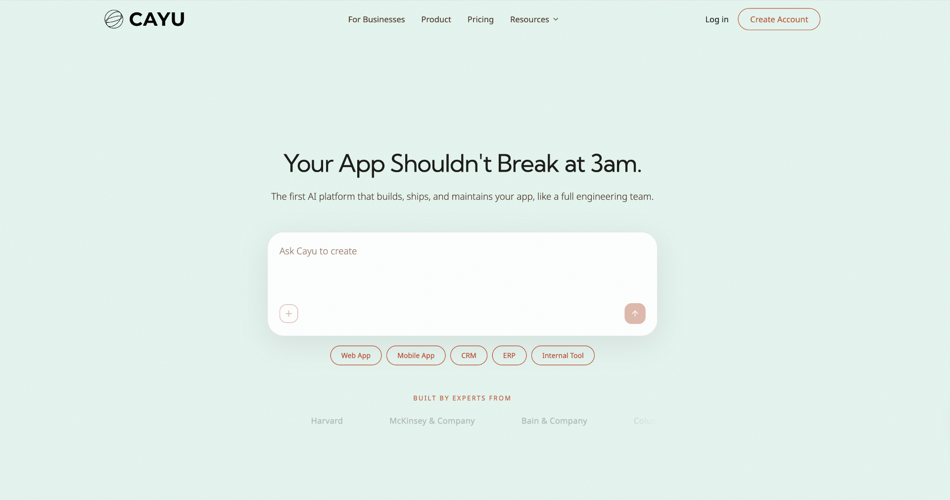
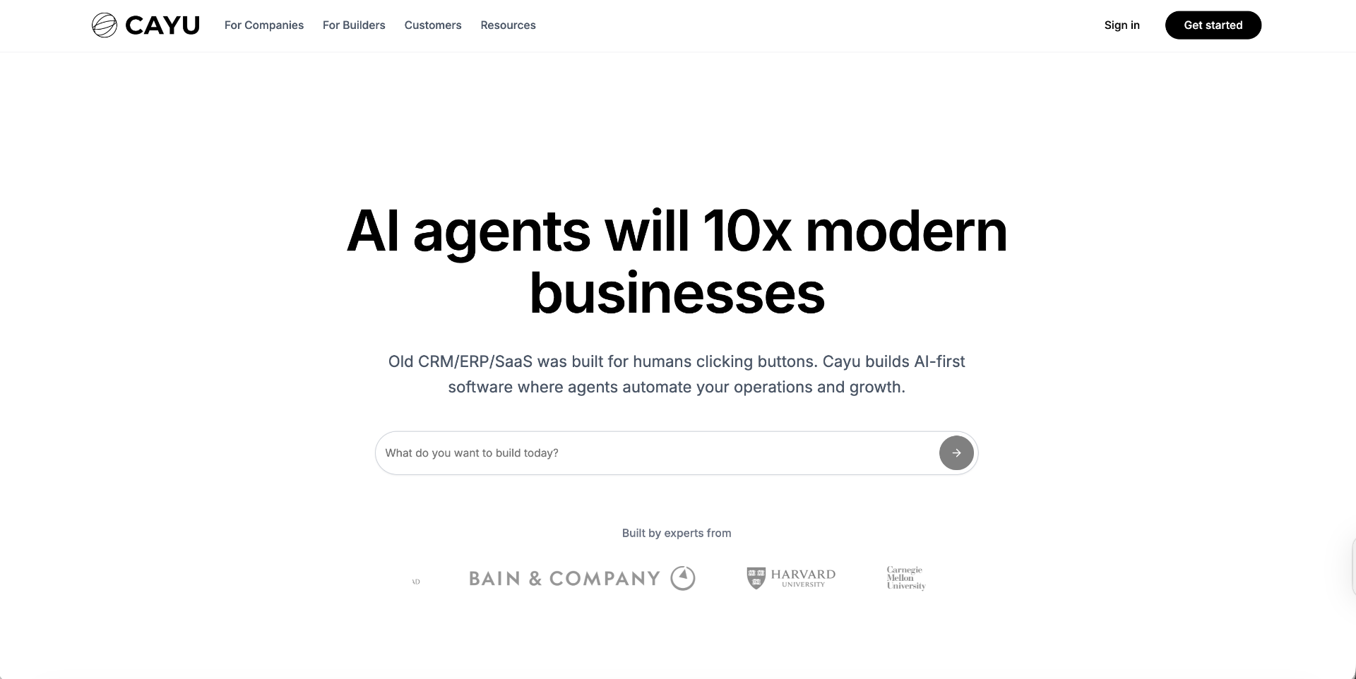
I rewrote the hero section to lead with the user's goal, not the technology. Instead of describing AI capabilities in abstract terms, the headline frames the value in terms of what the user gets: working software, built from a description, without the traditional development timeline.
I restructured the page into a clear narrative flow: hero → social proof → how it works → feature highlights → use cases → call to action. Each section answers the next logical question a skeptical visitor would have.
I developed a stronger brand expression that sets Cayu apart from the dark-mode-monospace default of most AI dev tools. The visual system balances technical credibility with approachability.
Landing page hero — before & after
Authenticated View Redesign
I redesigned the main workspace to prioritize orientation. Instead of dropping users into a blank state, the dashboard surfaces recent projects, suggested starting points, and contextual guidance. I restructured navigation to match how users think about their workflow — not how the engineering team organized features internally. Rather than exposing every feature at once, the interface reveals complexity as users demonstrate readiness.
Authenticated dashboard — before & after
Navigation — before & after
"Every friction point I hit as a designer-using-the-tool was a data point about the experience I was redesigning."
Key Decisions
Using the product as the design tool
By building inside Cayu rather than designing in Figma and handing off, I collapsed the gap between design intent and implementation reality. I experienced the AI's strengths and limitations firsthand, which directly informed my design choices — from how I structured the onboarding flow to what level of visual complexity the platform could reliably produce. This is what AI-fluent design practice looks like: not just designing interfaces for AI products, but designing with AI as a collaborator, understanding its behavior deeply enough to direct it toward high-quality outcomes.
Leading with outcomes, not technology
The original landing page led with technical descriptors — "agentic," "AI-powered," "autonomous." These terms mean something to people in the AI tools space, but nothing to non-technical founders. I shifted the messaging to lead with what users achieve and let the technology explanation follow as supporting evidence — a deliberate strategic choice to widen the funnel.
Designing continuity from marketing to product
Most tools treat the marketing site and the product as separate design problems. I intentionally designed both as one continuous experience. The language, visual cues, and information hierarchy carry through from landing page to authenticated view. This continuity is especially critical for AI products, where user trust is fragile and any disconnect between what's promised and what's delivered erodes confidence quickly.
Outcomes & Reflections
The Cayu founding team reported that the redesigned landing page more accurately reflected their product vision and gave them a stronger foundation for investor and partnership conversations. Early users who tested the redesigned authenticated experience reported feeling more confident navigating the platform and understanding what they could build. The most common feedback theme was clarity — users could articulate what Cayu does after a single visit, which hadn't been the case before. The redesign gave Cayu a visual and narrative identity distinct from competitors in the space.
What I learned
Designing with AI is a distinct skill, not just a shortcut. Prompting an AI platform to produce good design requires a different kind of craft than pushing pixels in Figma — more like creative direction than manual execution. The quality depends on how precisely you can articulate intent, how quickly you can diagnose what's off, and how effectively you can steer the AI toward your vision.
AI product design demands precision in abstraction. The hardest part wasn't the interface design — it was deciding how to explain an autonomous AI agent to people who don't think in those terms. Every word had to earn its place.
The landing page and the product are the same design problem. Treating them as separate workstreams would have produced a disconnected experience.
Visual identity is strategy, not decoration. In a market this crowded, looking generic is a positioning failure.