Navigate Enrollment
Redesigning Stanford's Enrollment Experience — from the Inside Out
Stanford had commissioned an external agency to redesign enrollment. When our team reviewed the designs, I identified fundamental structural problems and proposed an alternative. I put together a few high-fidelity screens in days that convinced stakeholders to set the agency's work aside.
Working from existing user research, I became lead designer and owned the end-to-end design — from the initial pitch screens through the full hi-fi prototype, usability testing, iteration rounds, and developer handoff — shipping a mobile-first enrollment system now used by every Stanford student, every quarter.
Lead UX Designer
UXDS — Stanford University
Stanford Registrar
Base22 Design → Navigate Enrollment
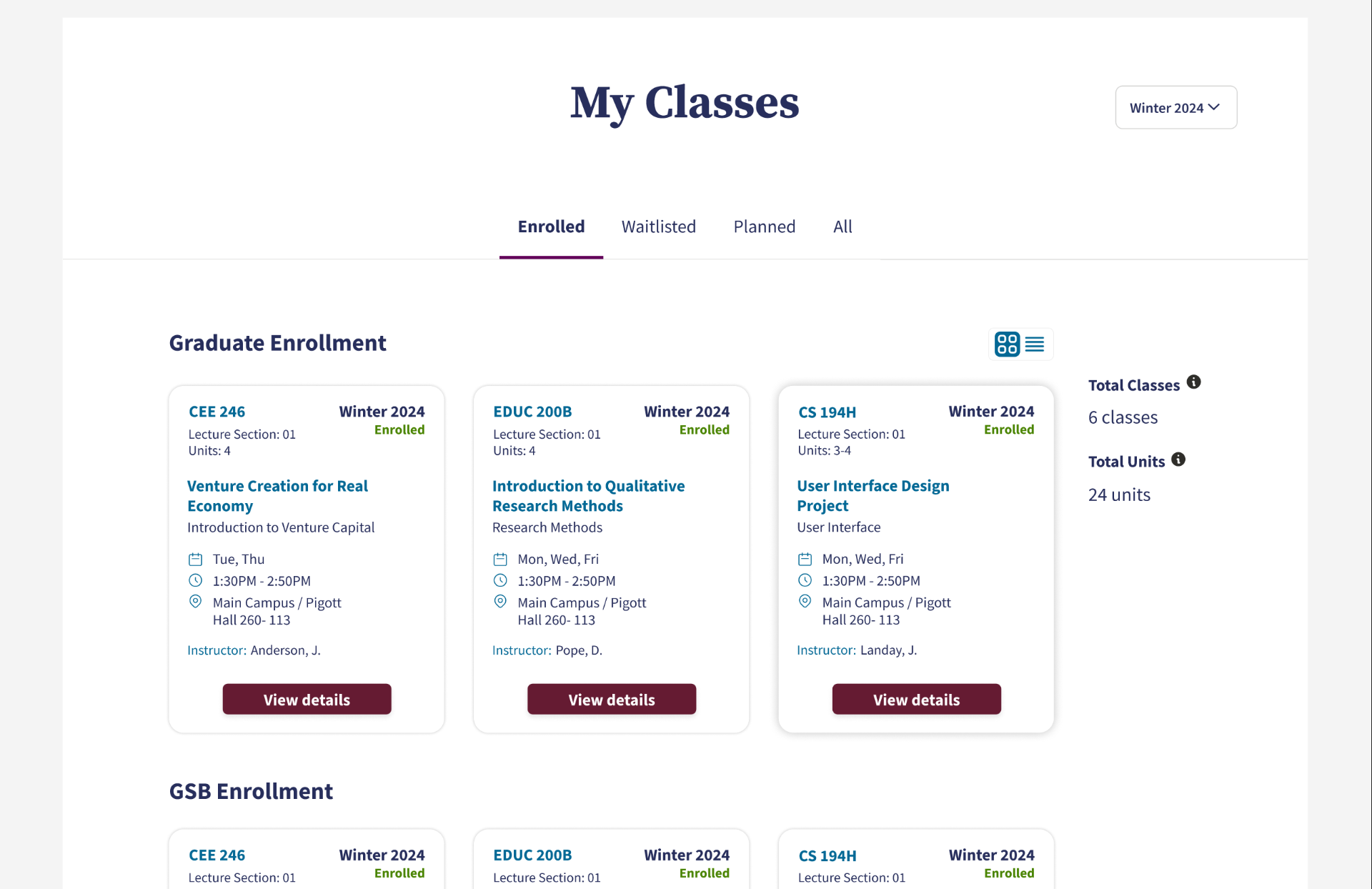
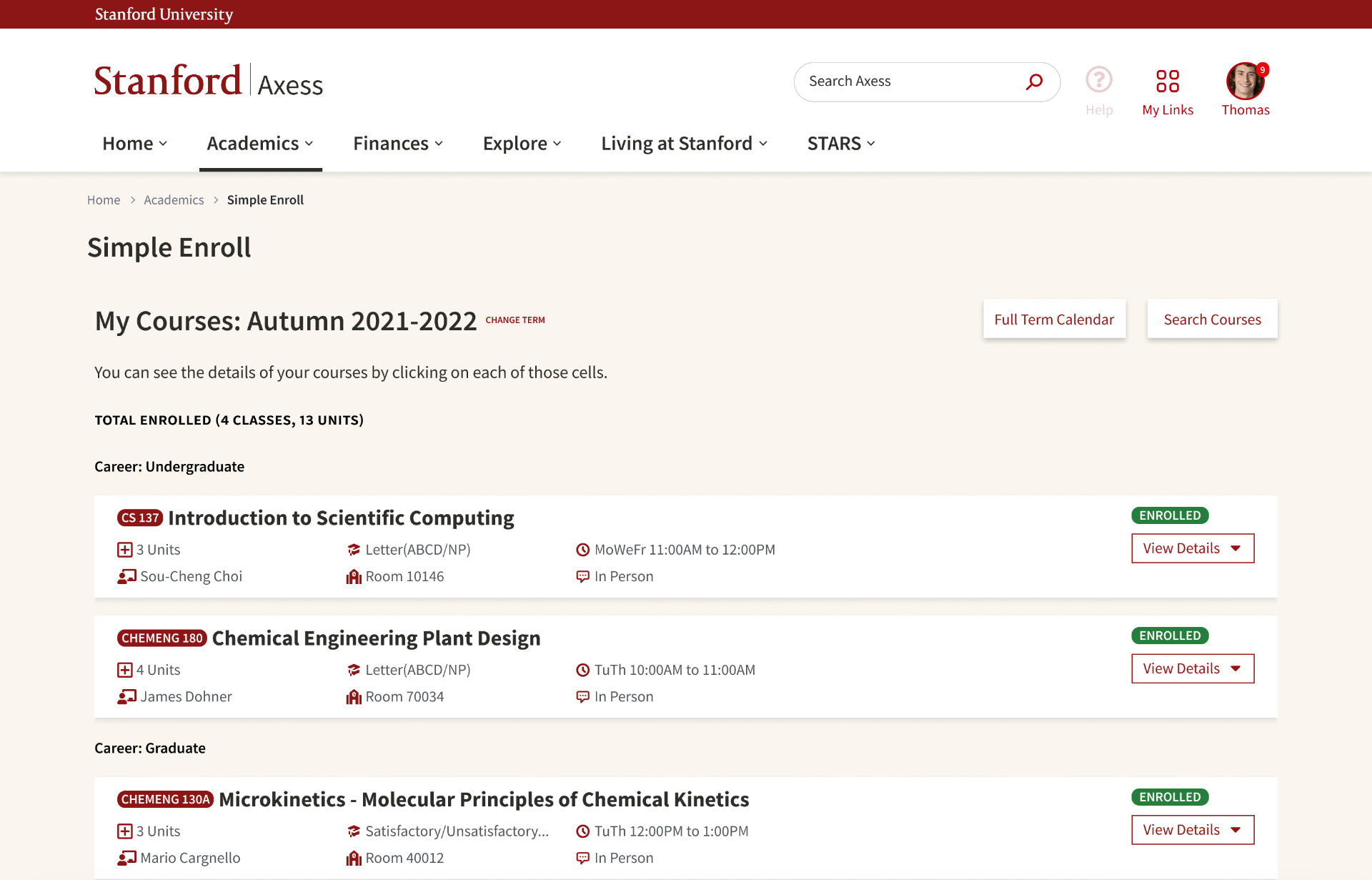
The agency's design and the replacement. The structural difference is immediate.
The Problem
Stanford had hired Base22, an external agency, to redesign Axess — the enrollment system every student uses multiple times a year to plan, register for, and manage their classes. The project was underway. Designs existed. Then our team reviewed them, and I saw something that couldn't be unseen.
The search box — the primary action students come to perform — was buried below a list of already-enrolled courses. There was no clear space for the three states that define every student's enrollment reality: what they're planning, what they've enrolled in, and what they're waitlisted for. The information hierarchy reflected a system's internal logic, not a student's mental model. Most critically, the mobile experience was an afterthought — which meant students who needed to act the moment their enrollment window opened, often from a phone, were still effectively locked out.
This wasn't a visual problem. It was a structural one. A fresh coat of paint on a broken architecture would give students a slightly prettier version of the same frustration for years. And the frustration was already severe — a concurrent Axess discovery study commissioned by Stanford's own Registrar's Office found that enrolling in classes was the single highest-impact pain point for both undergraduate and graduate students, rated very frequent, extremely important, and very low satisfaction. The same study found that Axess didn't orient students or set expectations, that navigation was unintuitive, that two separate enrollment tools existed simultaneously causing confusion, and that SimpleEnroll — the more modern of the two — crashed regularly during peak enrollment windows, forcing students to fall back to the legacy PeopleSoft system. The system wasn't just inconvenient. It was failing students at the most consequential moments of their academic calendar.
I said so — and then I offered to show a better way.
Base22 proposed design
The Pitch That Changed Everything
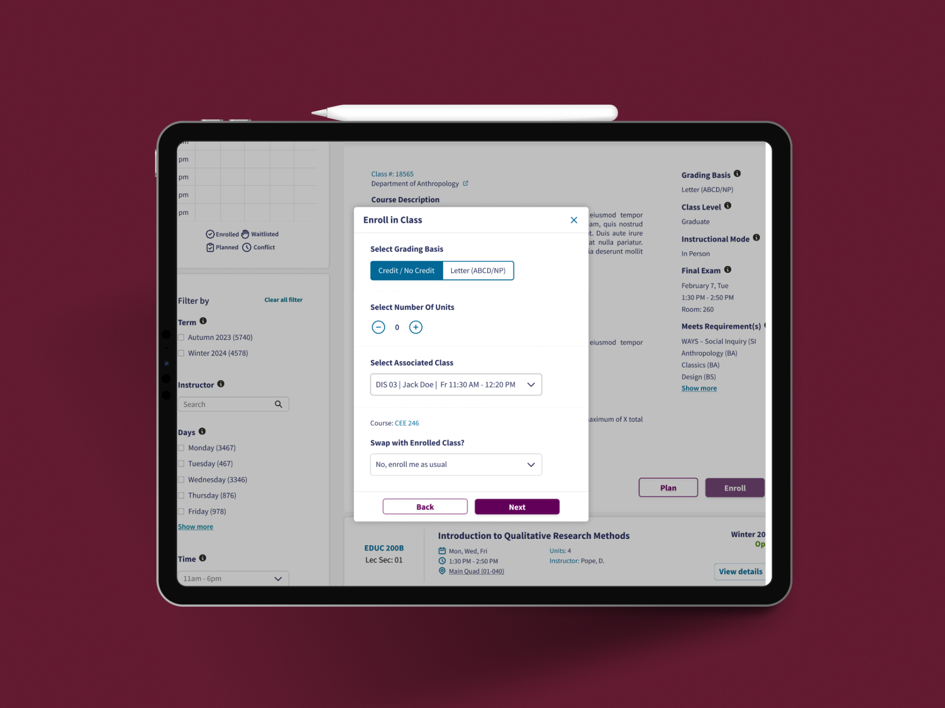
I didn't put together a full prototype or a complete design document. I built a small number of carefully chosen high-fidelity screens in Figma — enough to communicate the core vision clearly, and nothing more. That constraint was intentional. When you only have two or three screens to make your argument, every decision has to be immediately legible. There's no room to hide behind volume or explanation.
There was no existing design system to draw from. Every component, every interaction pattern, and every visual decision in those pitch screens was created from scratch — which made the speed of the pitch more significant, not less. What convinced stakeholders to change course was built from a blank canvas in a matter of days.
The direction was approved. The Base22 design was set aside, and I became the lead designer on the project.
Building the entire visual and interaction language from scratch also had a lasting consequence beyond this project. As the Navigator ecosystem grew — with Navigate Classes already in progress and products like Programs, Policies, and Departments on the roadmap — it became clear the team needed a shared design system. The patterns established here became the foundation that informed that decision, and the visual language created for Navigate Enrollment shaped everything that followed in the ecosystem.
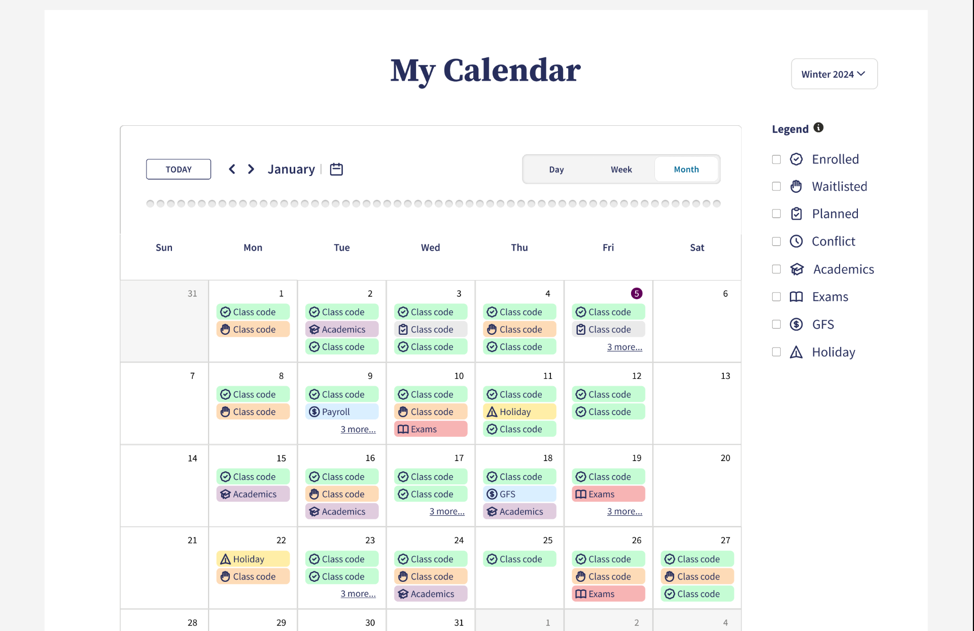
New proposed design
What Research Revealed
The user research foundation had already been laid before our team stepped in. The 2021 Stanford Academic Planning and Enrollment Discovery Project had mapped the enrollment journey in detail — not as a single action, but as a seven-phase arc spanning the entire quarter: getting started, building a plan, vetting classes iteratively, balancing and optimizing the term, creating a schedule, enrolling, and then assessing afterward. Students moved through this arc while managing work, athletics, jobs, and social commitments — and they did it across a fragmented set of tools with no single integrated view.
The core insight was that students don't experience enrollment as a single action — they experience it as an ongoing relationship with their schedule across an entire quarter. They plan weeks before their window opens. They move fast when it does. They adjust, waitlist, drop, and swap for weeks afterward. The old system had never been designed around that arc. It treated enrollment as a transaction when students experience it as a process. The research also found that students without strong peer networks or institutional familiarity — first-generation and low-income students in particular — were most disadvantaged by this, because they couldn't compensate for the system's gaps by leaning on upperclassmen or advisors who knew how things actually worked.
"Students don't experience enrollment as a single action. They experience it as an ongoing relationship with their schedule across an entire quarter."
Competitive Analysis
Before moving into design, I conducted competitive analysis across three categories. First, peer university enrollment systems — to understand what institutions like UW, Harvard, and UC Berkeley had built and where Stanford lagged. Second, student-created platforms like Carta and SimpleEnroll workarounds — because students had effectively voted with their behavior, and those tools revealed what the official system had failed to provide. Third, consumer calendar products — Google Calendar, Apple Calendar — specifically to inform the calendar feature. If students were going to trust a scheduling view inside an enrollment system, it needed to feel as fluent as the calendars they already used every day, not like an institutional afterthought. That benchmarking shaped the decision to offer monthly, weekly, and daily views with the same interaction conventions students already knew.
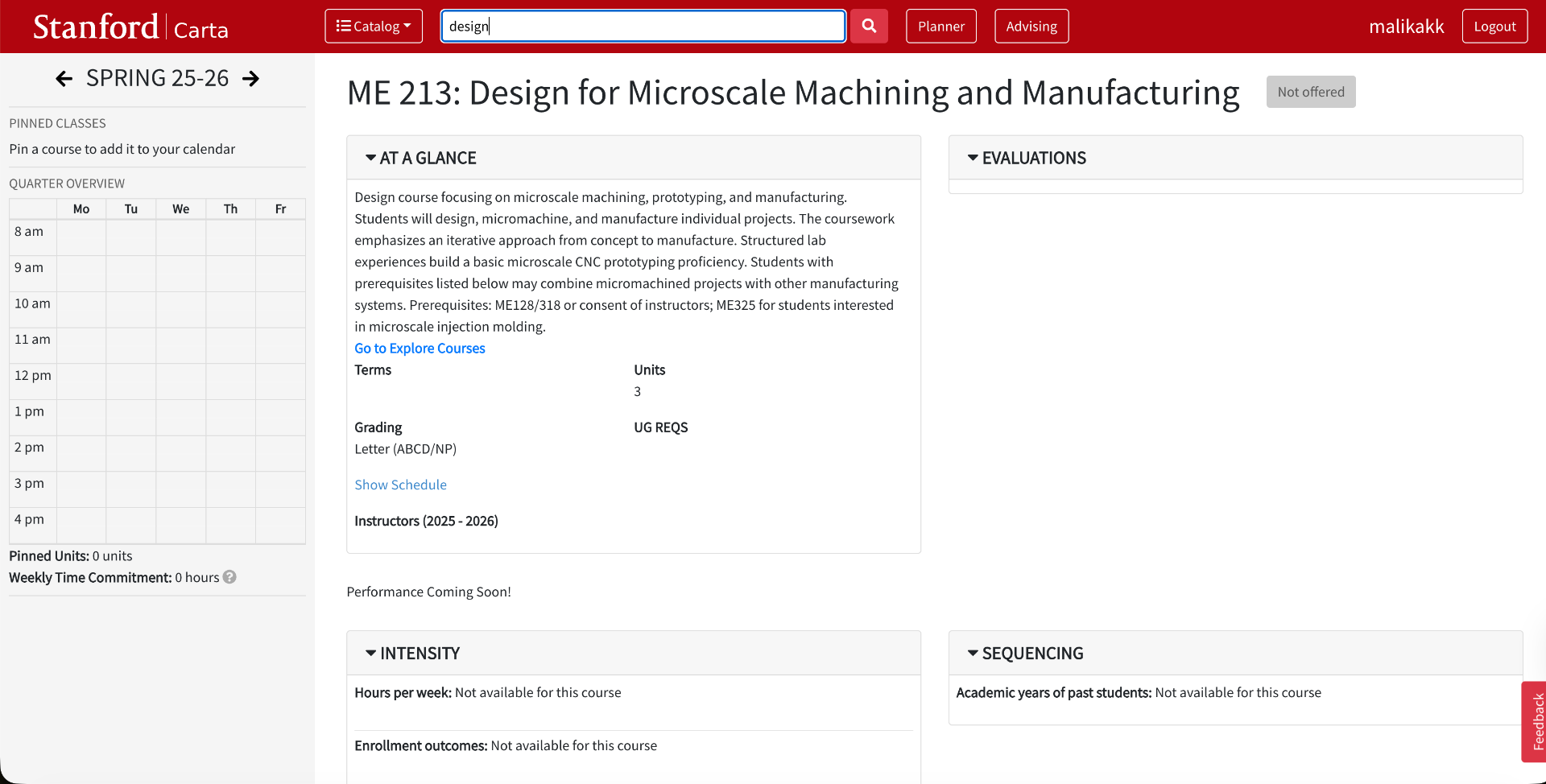
Carta — platform developed by Stanford students
The Design
One Dashboard, Three States
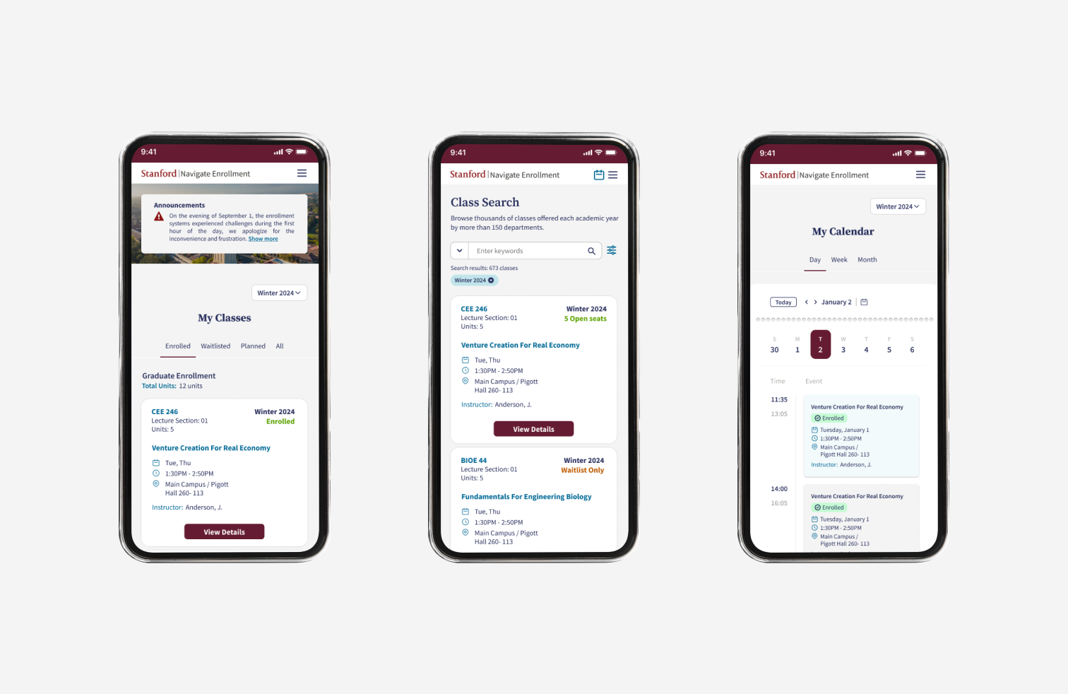
The enrollment dashboard brings a student's planned, enrolled, and waitlisted classes into a single page using tab navigation. This decision came directly from how students actually move through enrollment season — they're constantly checking whether a waitlisted class has opened up, confirming what they're enrolled in, and adjusting what they've planned. Separating those three views into different pages would mean full navigation jumps for what are essentially quick status checks. Tabs keep all three states one tap away without losing context, making the most frequent actions feel effortless rather than procedural.
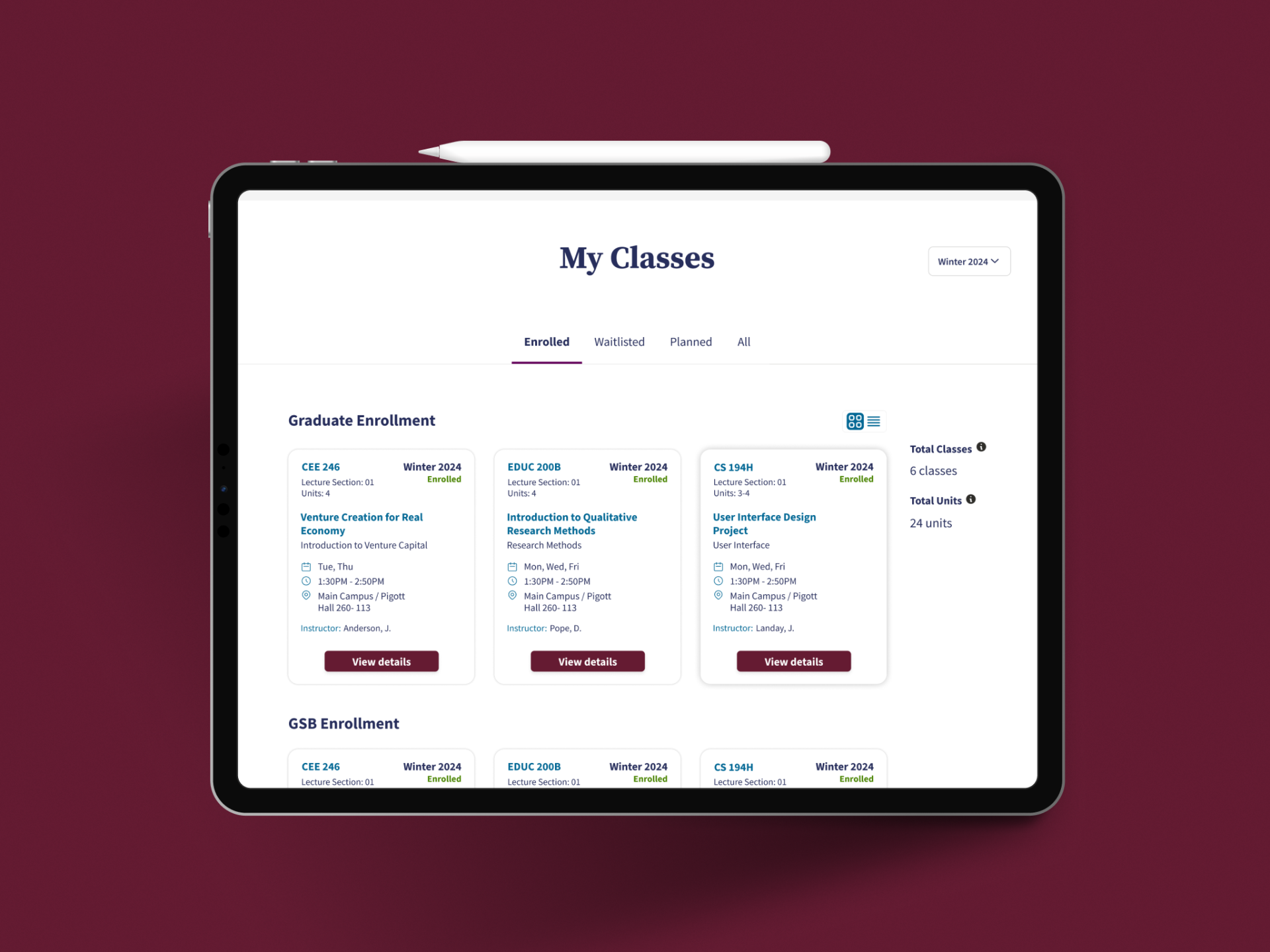
Search as Its Own Space
Class search lives on a dedicated page — intentionally separate from the dashboard. This wasn't a default choice; it was an architectural one. The search experience needed to hold a lot: a powerful search bar, rich filtering by time slot, workload, units, and prerequisites, class results in both grid and list views, and a live visual schedule that updates as students consider adding classes to their week. Putting all of that into a drawer or overlay on the dashboard would have compromised both experiences — the dashboard would feel cluttered, and the search would feel constrained. A dedicated page gives search the space it needs to be genuinely useful rather than just technically present.
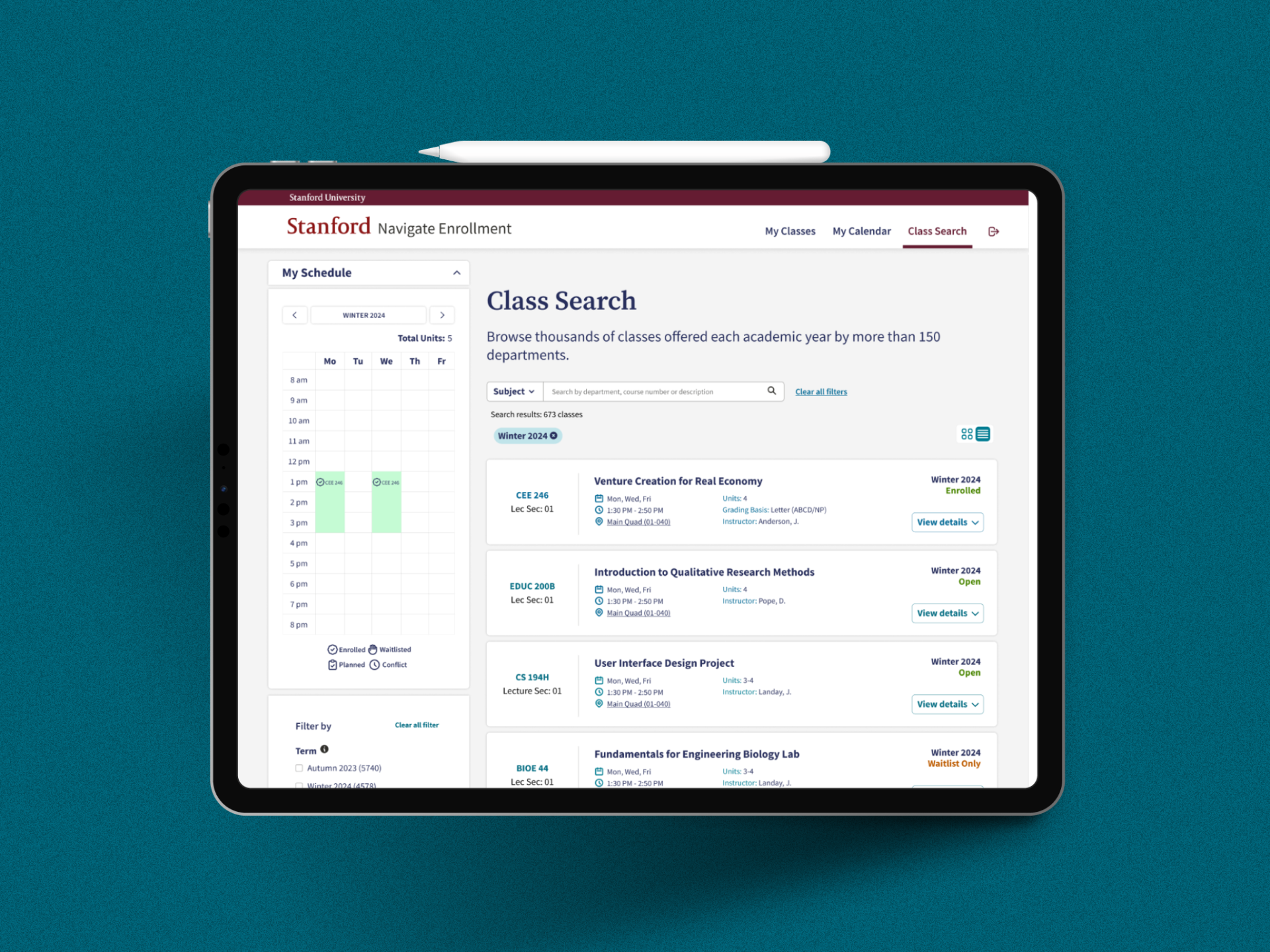
Class Search
The Calendar
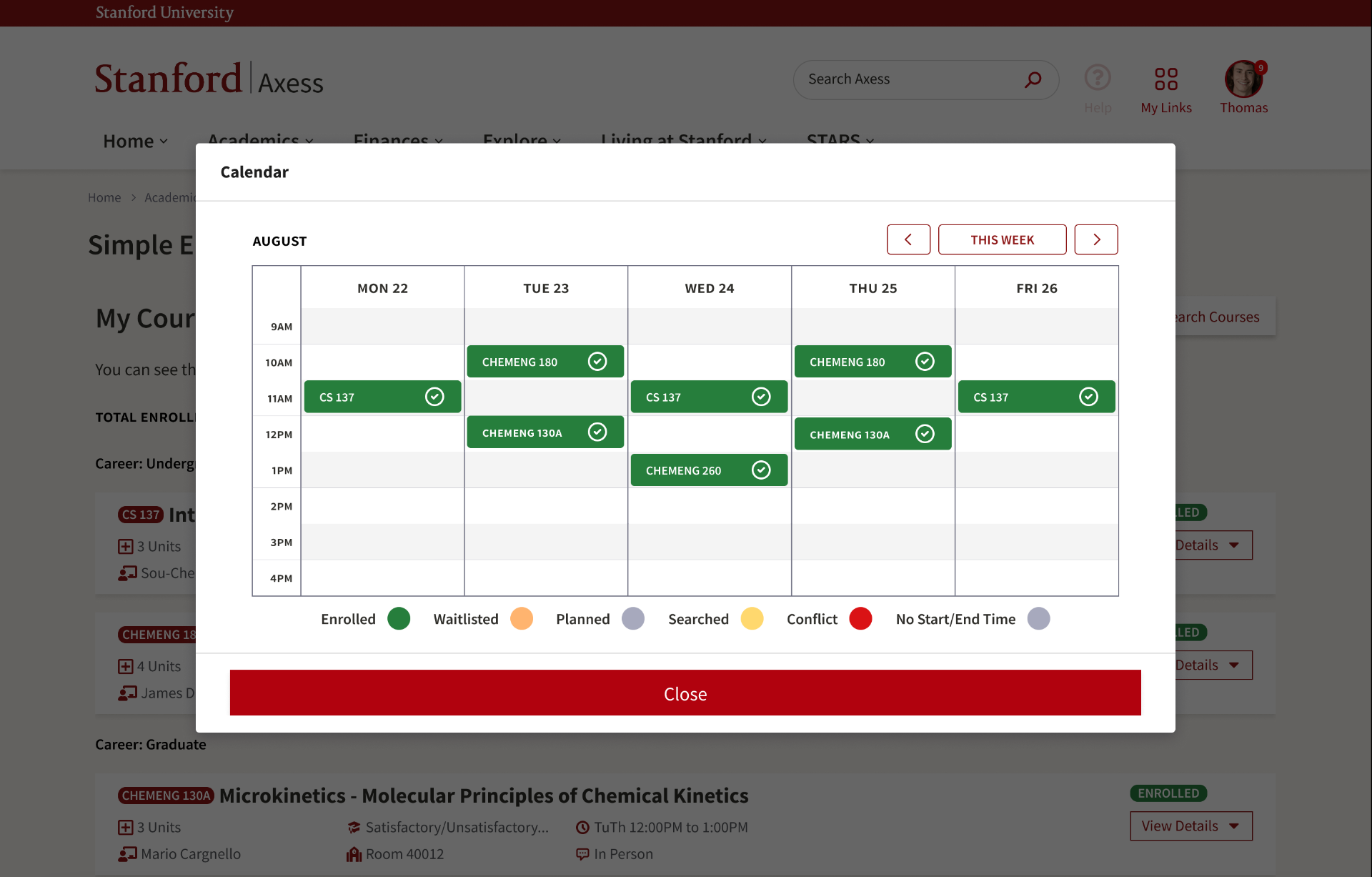
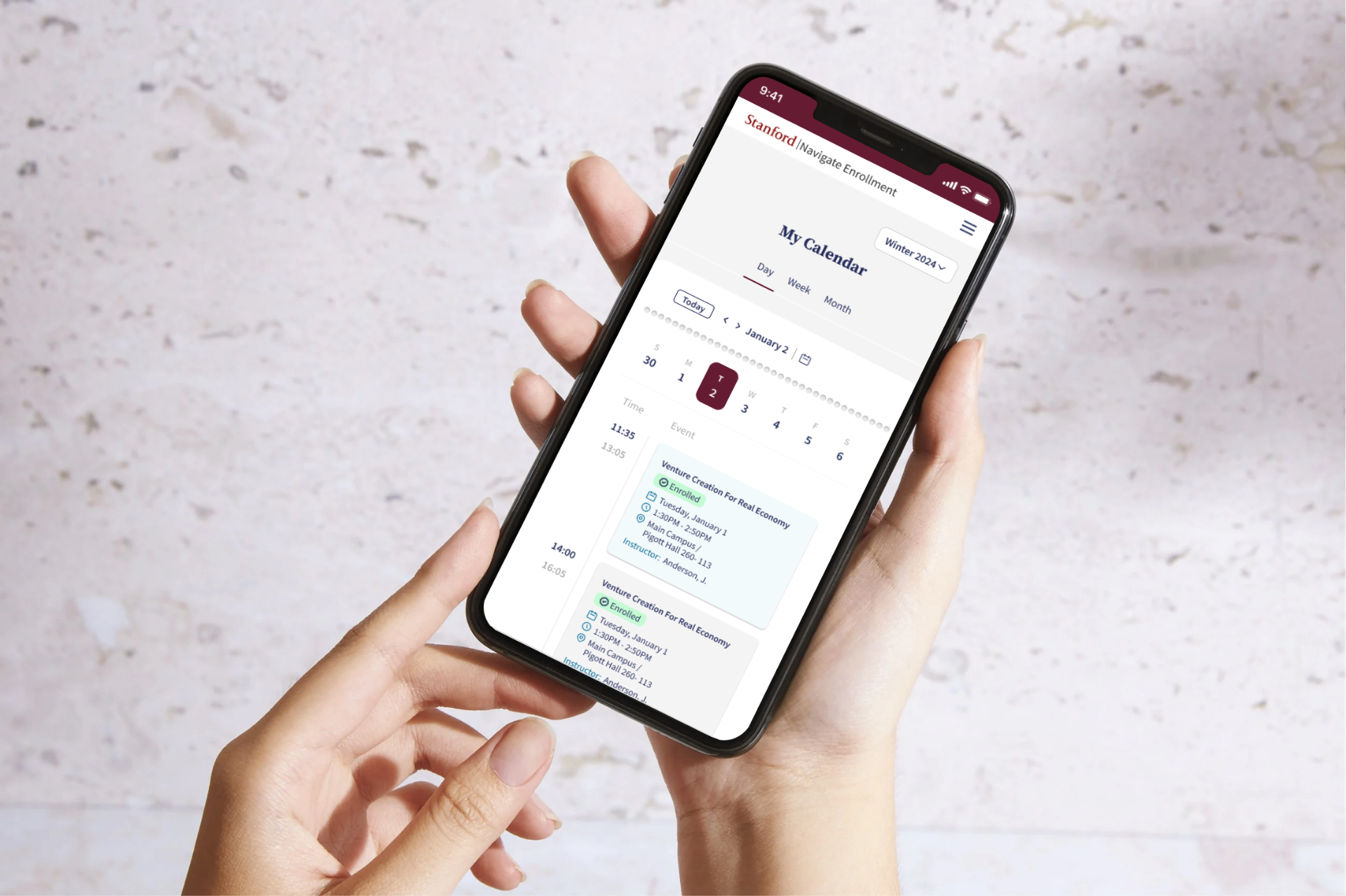
Axess had no calendar view. Students who wanted to visualize their week before committing to a class had to map days and times manually — in a personal spreadsheet, a notebook, or their head. The 2021 research documented this explicitly as a functional gap students had to solve themselves, and it was a significant source of scheduling errors and conflicts.
A dedicated calendar page with monthly, weekly, and daily views gave students a way to think about their schedule temporally rather than just as a list. This matters because students make enrollment decisions based on time: they want to know what Tuesday afternoon looks like before they add a 2pm seminar to it. A list of enrolled classes doesn't answer that question. A weekly calendar does, instantly — and it's the first time that answer existed inside the enrollment system itself.
Mobile Calendar
Mobile-First, Without Compromise
Every screen was designed mobile-first, and this was the non-negotiable principle that shaped the entire project. Enrollment windows at Stanford open at specific times. A student whose window opens at 7am while they're commuting shouldn't have to wait until they reach a laptop. Designing desktop-first and adapting down would have produced a mobile experience that worked technically but felt like a compromise. Designing mobile-first meant the core interactions — checking your classes, searching, enrolling, monitoring your waitlist — were fluent on a small screen from the beginning, and the desktop experience expanded from that solid foundation.
Testing & Iteration
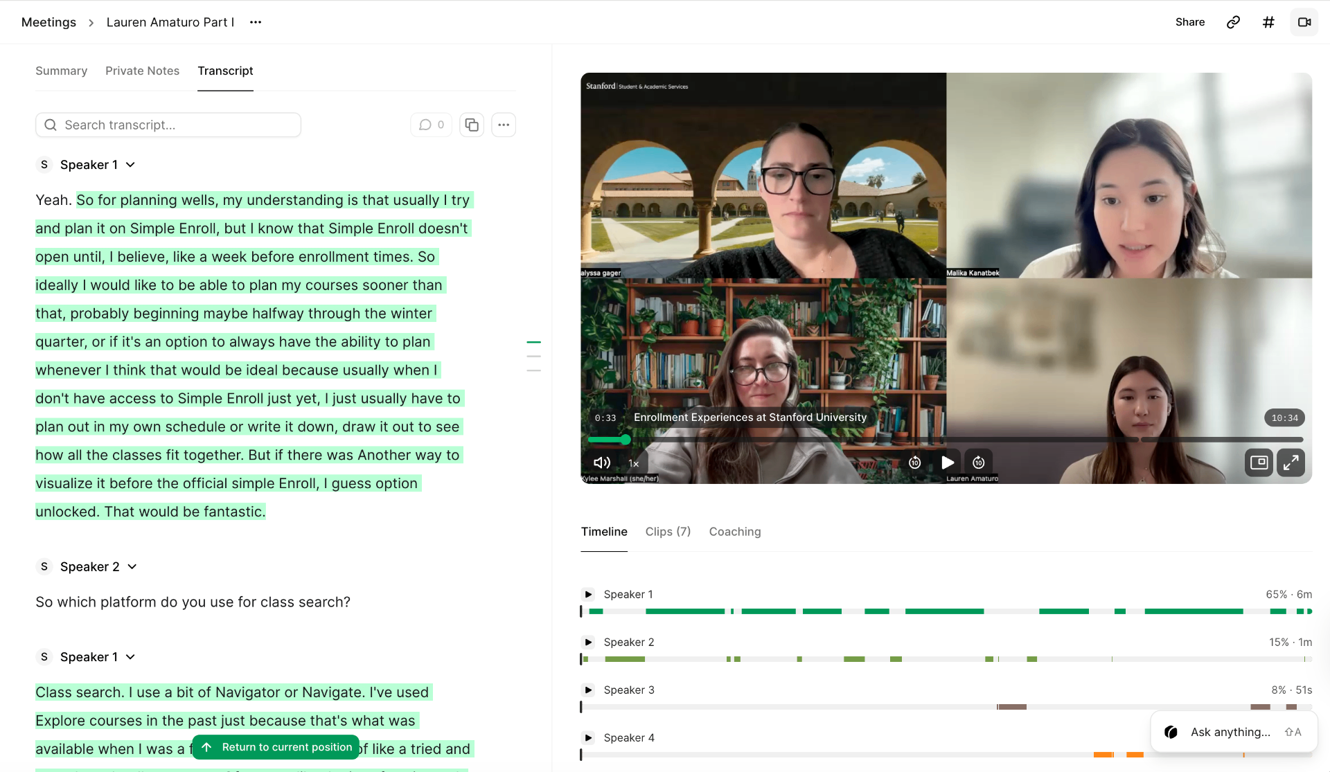
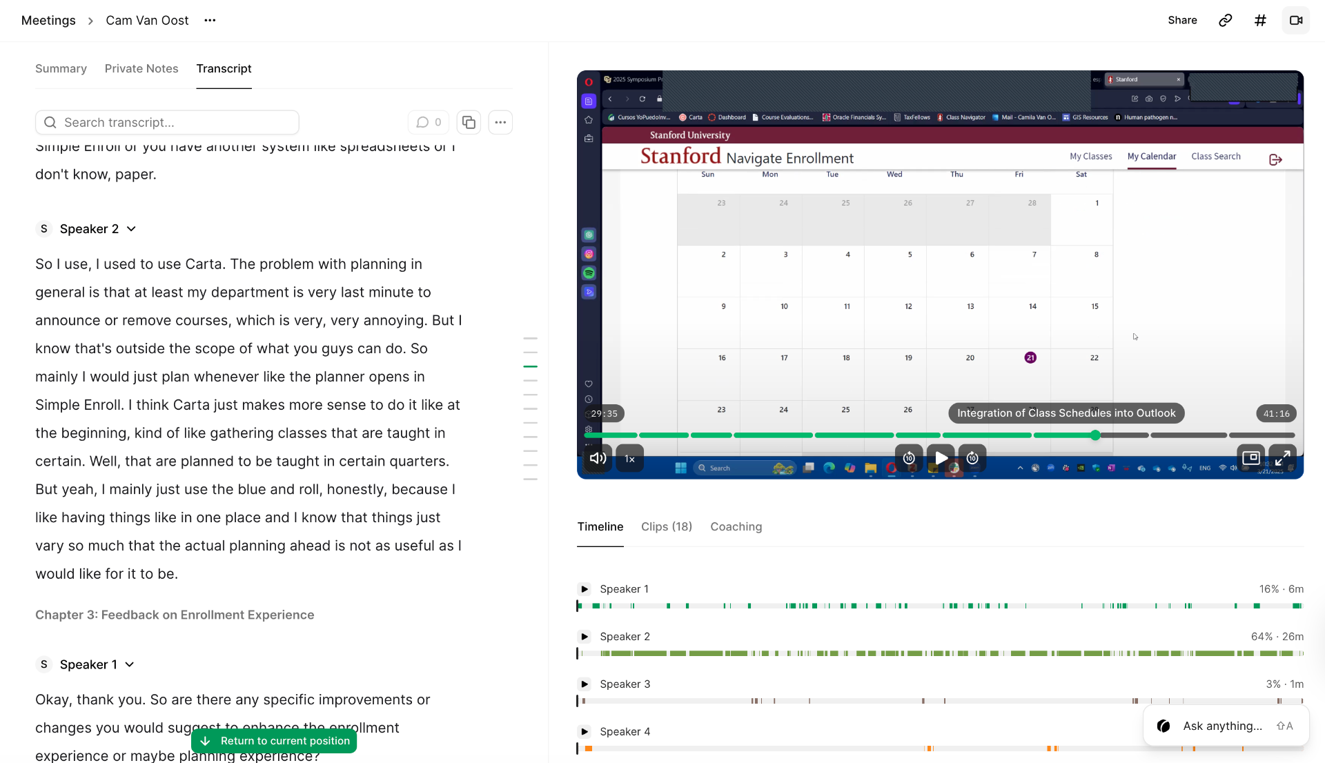
Once the initial pitch was approved, the work deepened considerably. Usability testing was conducted across multiple rounds, each with approximately 10 students — a mix of undergraduate and graduate participants, diverse across academic years and departments. Two rounds of testing were run: one on the Figma prototype before development, and one on the live product after launch.
The first round surfaced specific friction points the initial screens hadn't anticipated. One recurring issue was clarity around class status on the dashboard — students weren't immediately certain whether a class in their Planned list was still open for enrollment, already full, or restricted to specific programs. We responded by introducing real-time availability indicators directly on the class cards, so status was visible at a glance without requiring students to navigate into a class detail page to find out. That single change reduced a meaningful point of confusion into a non-issue.
Each test round produced concrete changes grounded in observed behavior. The iterative rounds between testing, review, and redesign — along with thorough Figma documentation including annotated specs and a component library for developer handoff — are what turned the original pitch into something production-ready.
Impact
Navigate Enrollment is live at enrollment.stanford.edu. It is Stanford University's enrollment system, replacing Axess — and Stanford's own Student Services pages describe it as "a modern, mobile-adaptive enrollment system, designed for and with students." Every one of Stanford's 17,000+ enrolled students uses it to plan, register for, and manage their classes every quarter.
That phrase — designed for and with students — is the one that matters. It's precisely what the Base22 design had failed to be, and it's what this project set out to prove was possible.
What began as a heuristic evaluation of an agency's work — and one designer raising her hand to say I think we can do better — became the enrollment infrastructure for one of the world's leading universities. Two or three screens built from scratch in days grew into a live product that every Stanford student uses to shape their academic life, every quarter.