Stanford Bulletin
Redesigning Stanford's Academic Source of Truth
Stanford's academic landscape is rich, complex, and poorly served. For years, students, advisors, faculty, and staff navigated it through a fractured set of tools that had accumulated over decades rather than been designed as a system.
Three tools had become redundant, outdated, and actively harmful:
- Graduate Academic Policies & Procedures (GAP) — a standalone policy repository disconnected from course and program information, difficult to navigate, and out of sync with how students actually look for guidance.
- Explore Courses — the authoritative class search tool students found so unusable they built third-party replacements around it.
- Explore Majors — a separate tool for degree programs, disconnected from course search and policy information, forcing students to cross-reference multiple sources to understand what a major required.
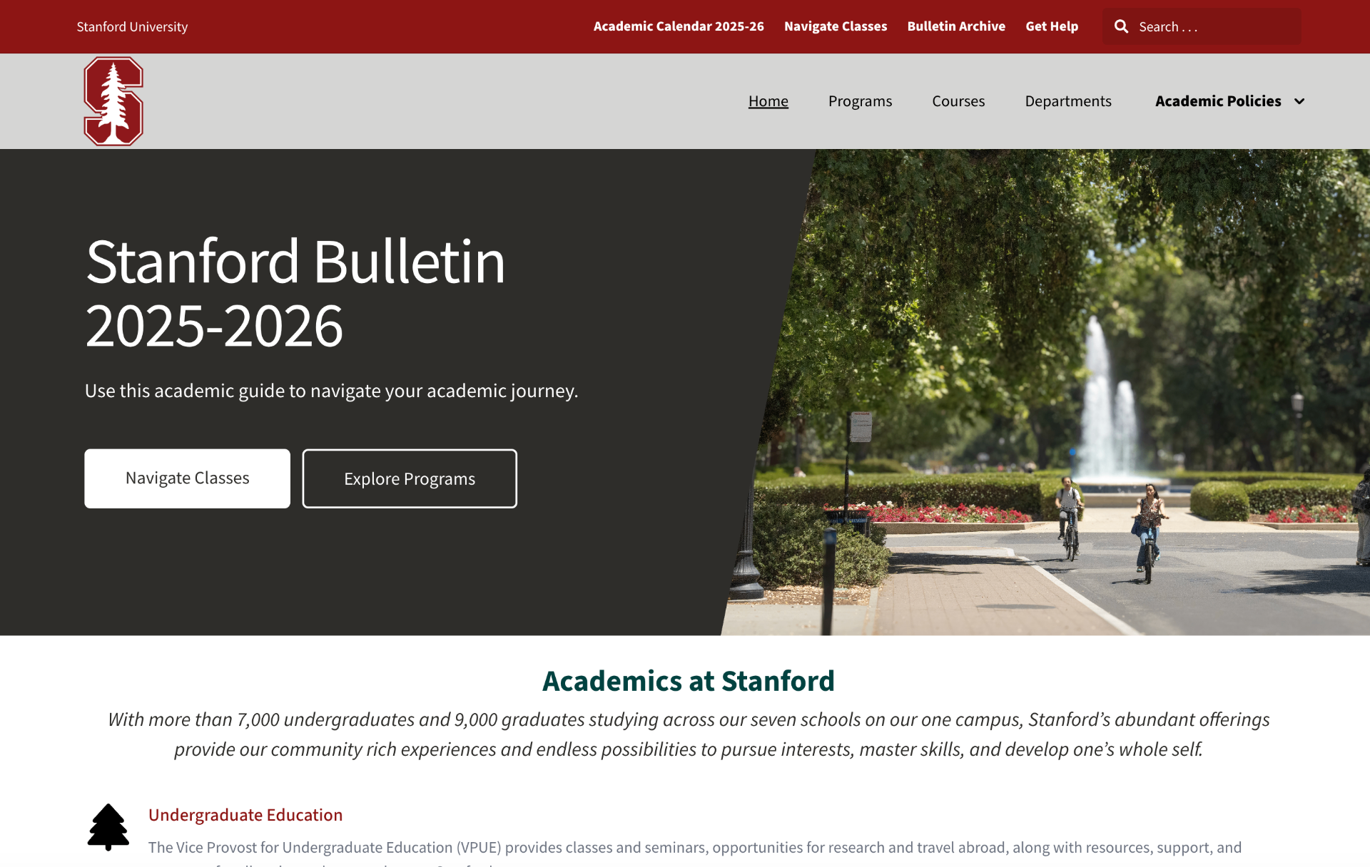
The result: students routinely went to departmental websites instead of the official Bulletin — because the official source of truth had become too fragmented to trust. The Bulletin is the third phase of Completing Connected Curriculum, following Navigate Enrollment (replacing Axess) and Navigate Classes (replacing Explore Courses).
Lead Product Designer
User experience and Design Strategy
Stanford Web Services
Stanford Registrar
Challenge
How might we consolidate three fragmented, outdated tools into one authoritative platform — serving students, advisors, faculty, and staff, each with different information needs — without any of them feeling underserved?
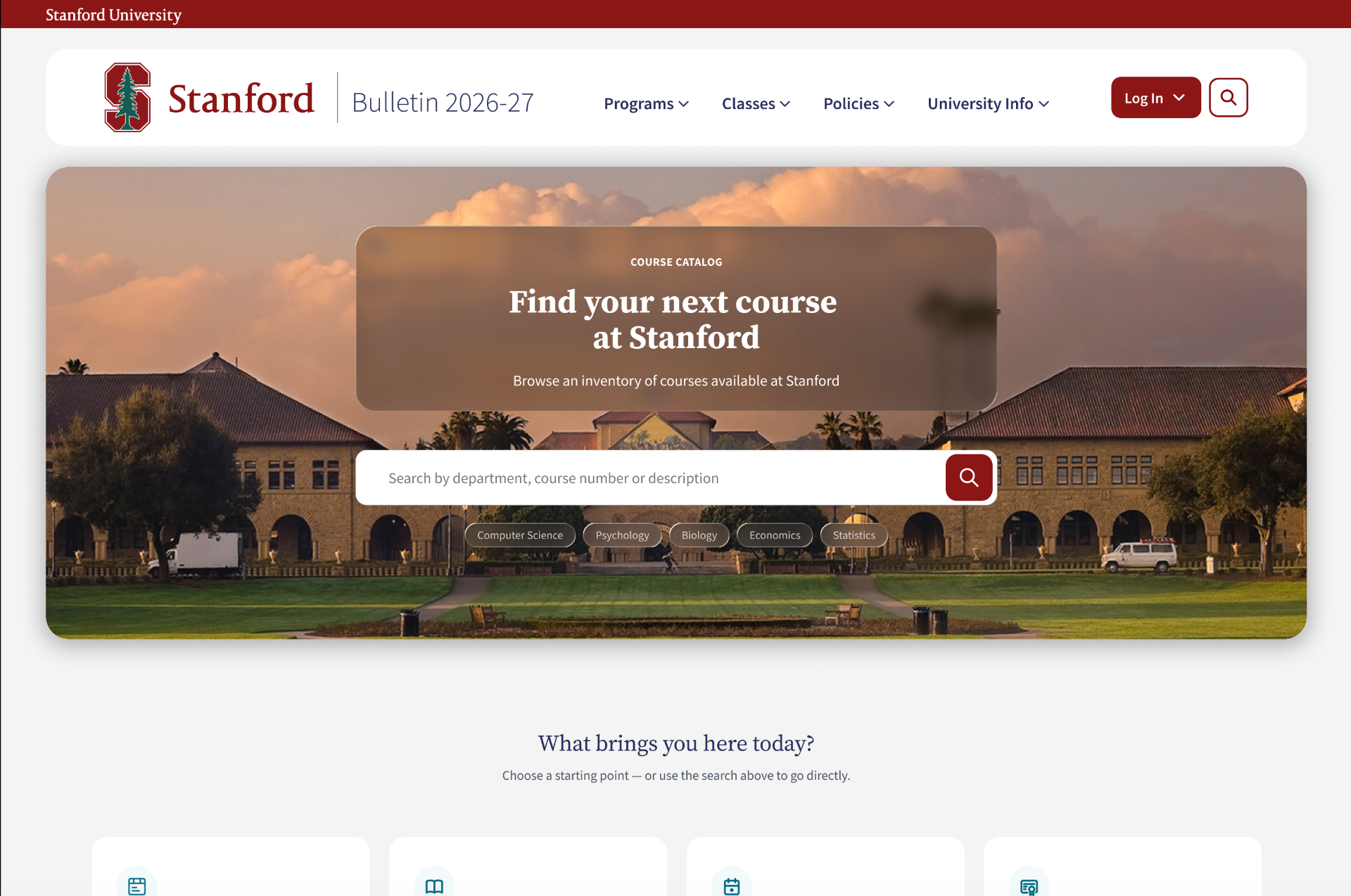
Old Bulletin → New Bulletin
Three fragmented tools replaced by one authoritative platform.
Constraints
- Scale. 15,875 classes and 349 programs, each needing to remain scannable rather than overwhelming.
- Structural variance. Degree requirements are deeply nested and vary significantly from program to program — a structure that has to hold up whether it's describing a lean minor or a heavy-content program like Biology BS.
- Competing precision needs. Requirements had to be scannable enough for a student making a fast decision, and precise enough to serve as the authoritative record faculty rely on. Early designs that solved for one consistently failed the other.
- Uneven scope. Departments range from small humanities programs to large engineering schools — one component system has to serve both without feeling like a poor fit for either.
- Split ownership. I own Courses and Programs end-to-end; Policies and Departments are directed by me but built by SWS — meaning design consistency has to hold across two different working models.
Research
User research drew on multiple institutional studies across Stanford's student, faculty, and staff communities. (Given privacy constraints, specific findings and participant data remain confidential.) What the research consistently confirmed: current tools were unclear, inconsistent, and most harmful to the users with the least institutional support to compensate for that inconsistency.
Usability testing ran at each design milestone, roughly 10 participants per round. Courses was tested on the hi-fi prototype before development; Programs is in testing now. The most significant testing-driven iteration came from the Requirements page — the tension between student scannability and faculty precision drove multiple rounds before an accordion-based approach, using visual differentiation between nesting levels, resolved it. I used UX Pilot to rapidly generate and evaluate multiple structural approaches before converging on that solution. Nothing moves to development until testing confirms it solves the problem it was built to solve.
What this research led to
A progressive-disclosure system — Bite, Snack, Meal — adapted from the model established in Navigate Classes for the Bulletin's role as authoritative reference rather than discovery engine. A Bite is the minimum signal needed to decide whether to look further. A Snack is a preview that surfaces key details without leaving the browsing context — where most real decisions happen. A Meal is the full detail page, the complete official record. This system exists because a prospective student scanning programs, an advisor checking a specific prerequisite, and a faculty member reviewing an official record all need different depth from the same interface — and the research made that gap concrete rather than assumed.
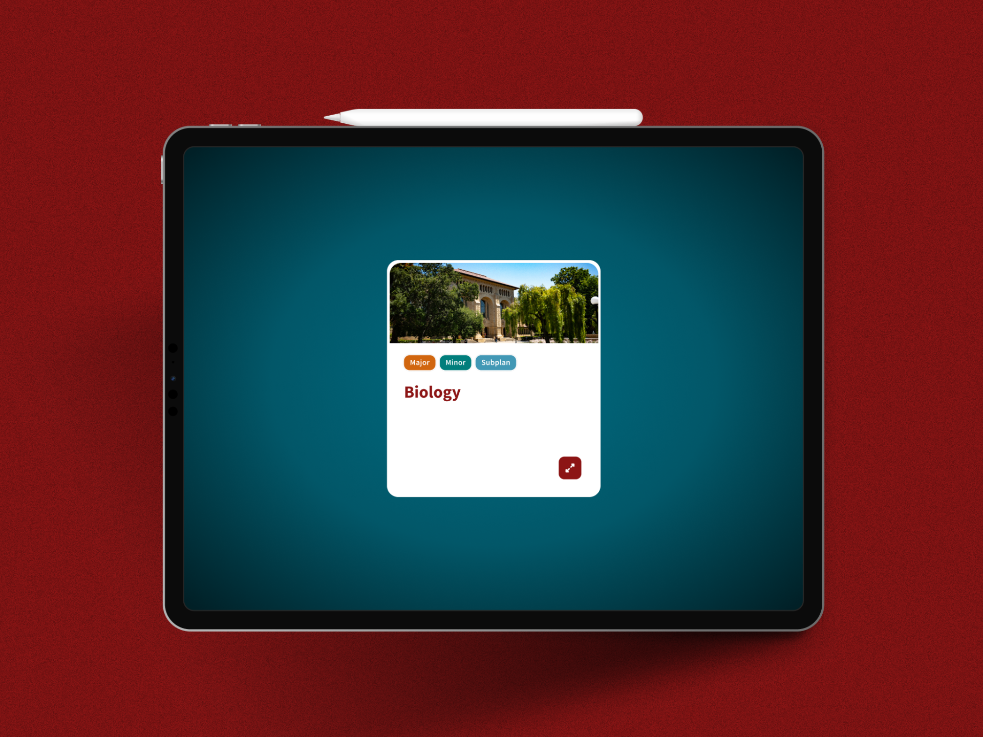
Bite — A glanceable summary for quick scanning
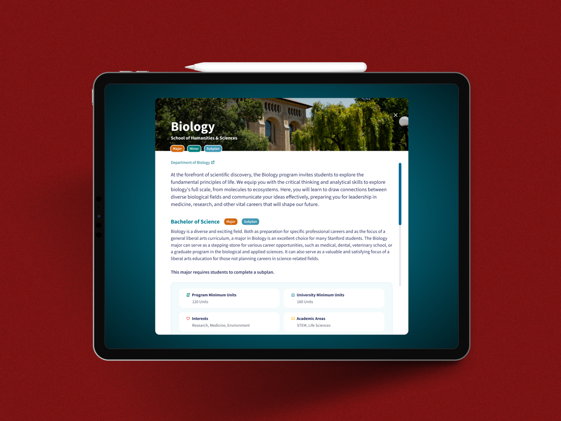
Snack — A detailed preview without leaving context
Meal — The full authoritative record for deep engagement
Key user needs
- As a prospective student, I want to scan programs and courses quickly, so I can narrow my choices before committing to a full read.
- As an advisor, I want to find a specific requirement fast, so I can answer a student's question without excavating nested content.
- As faculty, I want the official record to be complete and precise, so it holds up as the authoritative version of the degree.
Key features
Courses
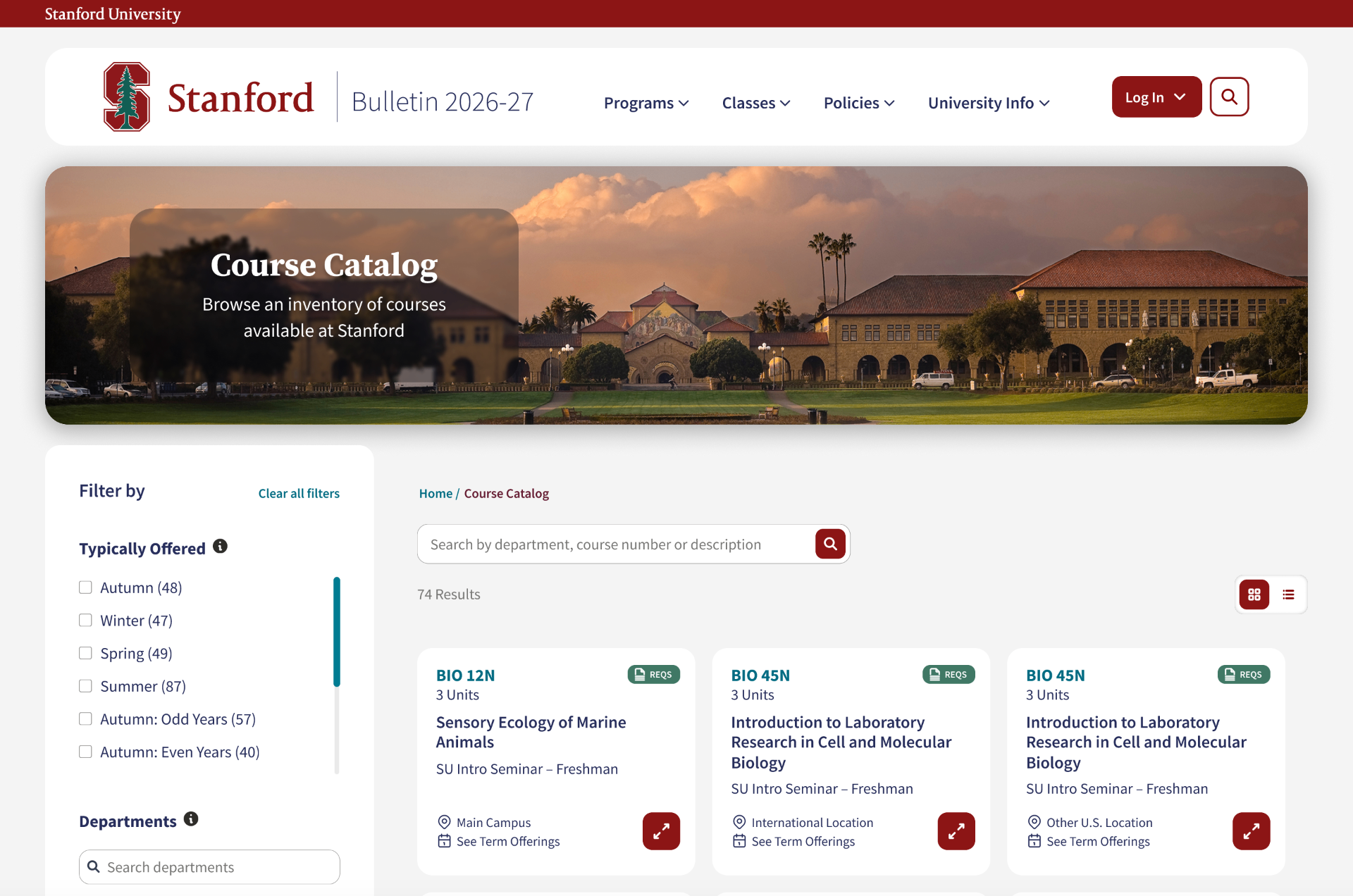
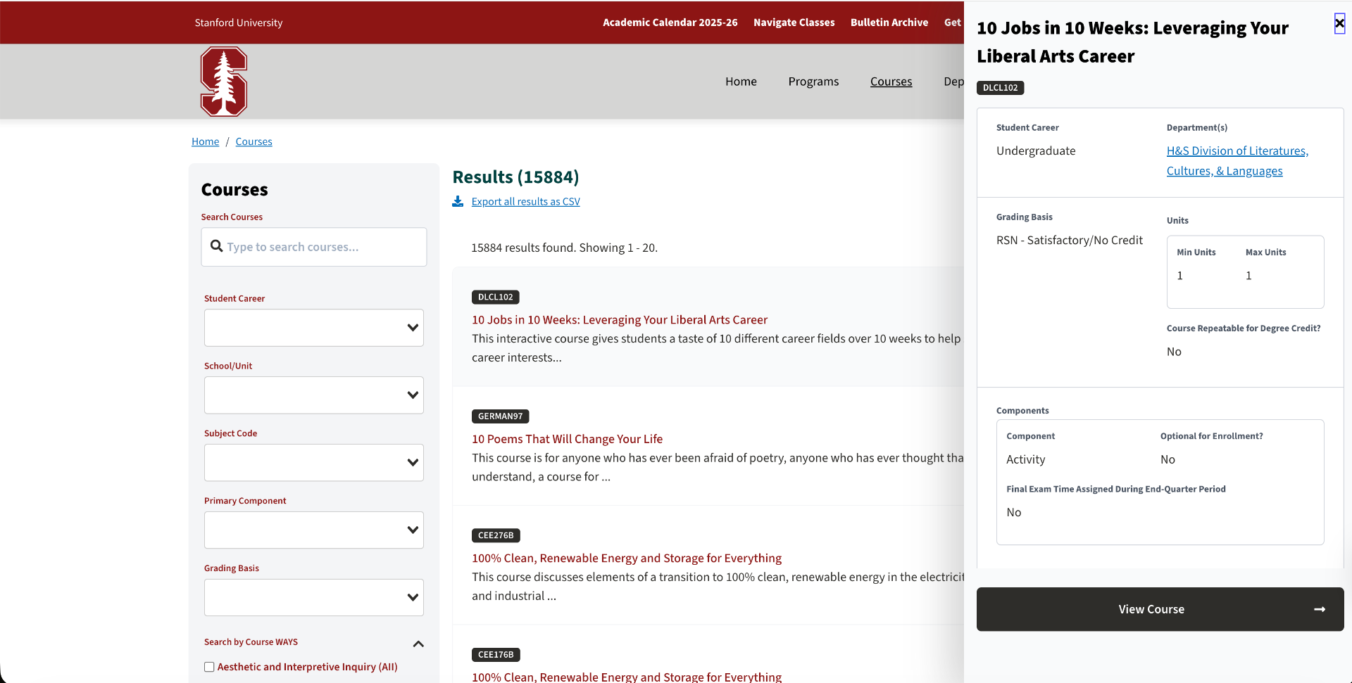
The old Courses section was a dropdown-filtered text list of 15,875 classes with no visual hierarchy and no way to evaluate a class without clicking through. The Bite/Snack/Meal structure answers this directly: the Bite is the course card in search results (code, title, brief description, key metadata); the Snack expands in place to show prerequisites, units, grading basis, and terms offered — without leaving the results view; the Meal is the full official record. The critical decision was distinguishing this from Navigate Classes, which serves discovery — the Bulletin serves the authoritative-record moment for the same user. Courses is fully designed, tested on the hi-fi prototype, and submitted for development.
Programs
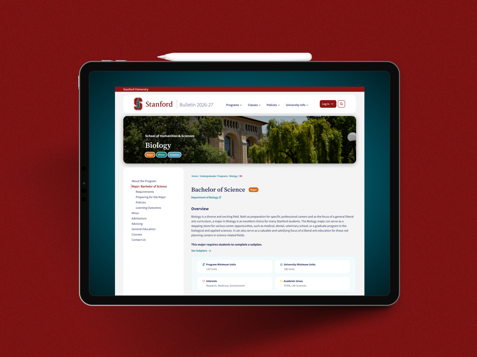
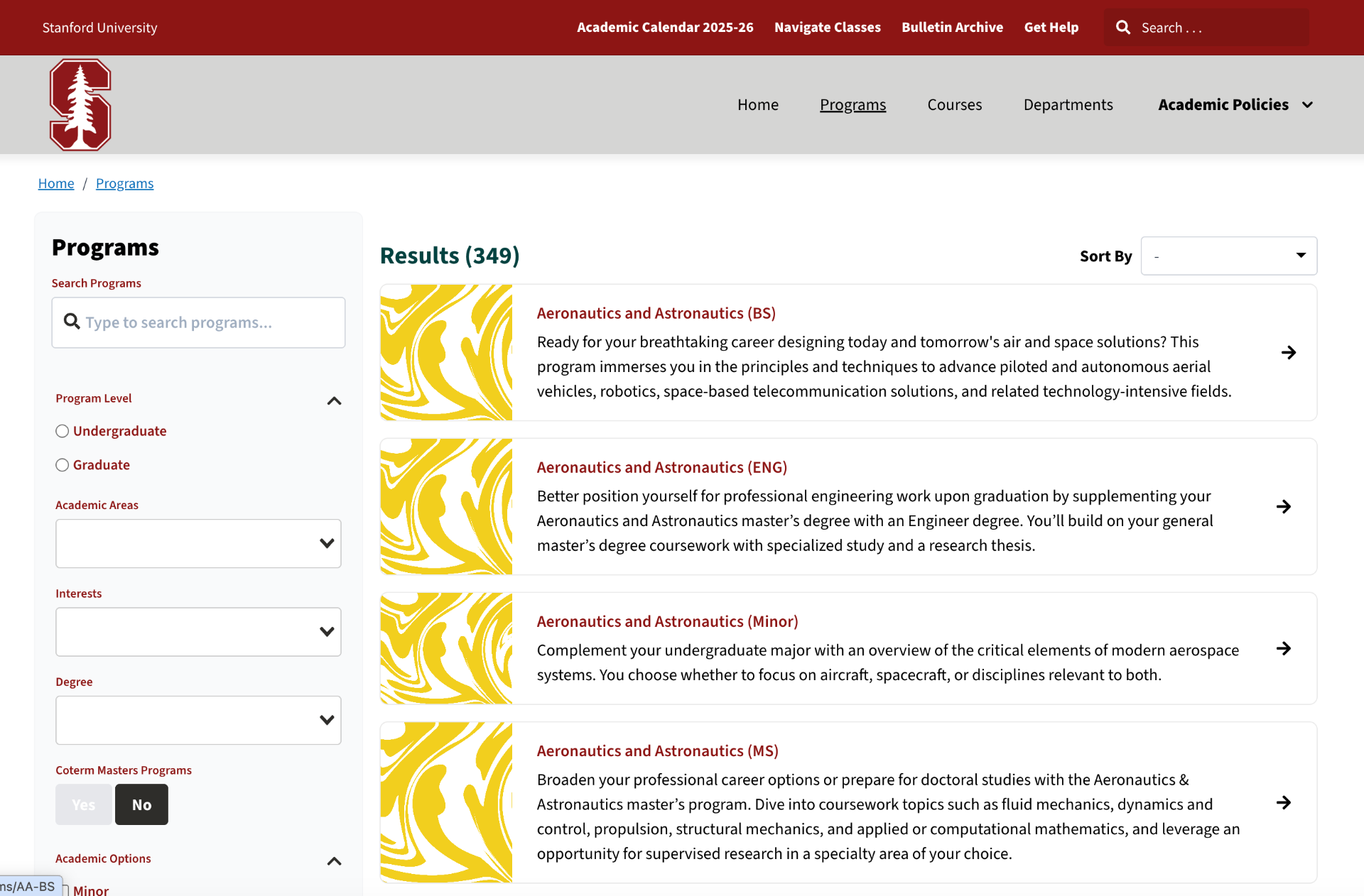
The current Biology BS page — chosen as a stress test because it's a heavy-content program — shows the problem structurally: a generic, non-specific hero image, program type buried in a title string ("Biology (BS)"), no surfacing of subplans at all, and degree requirements buried in accordion-within-accordion with no visual differentiation between nesting levels.
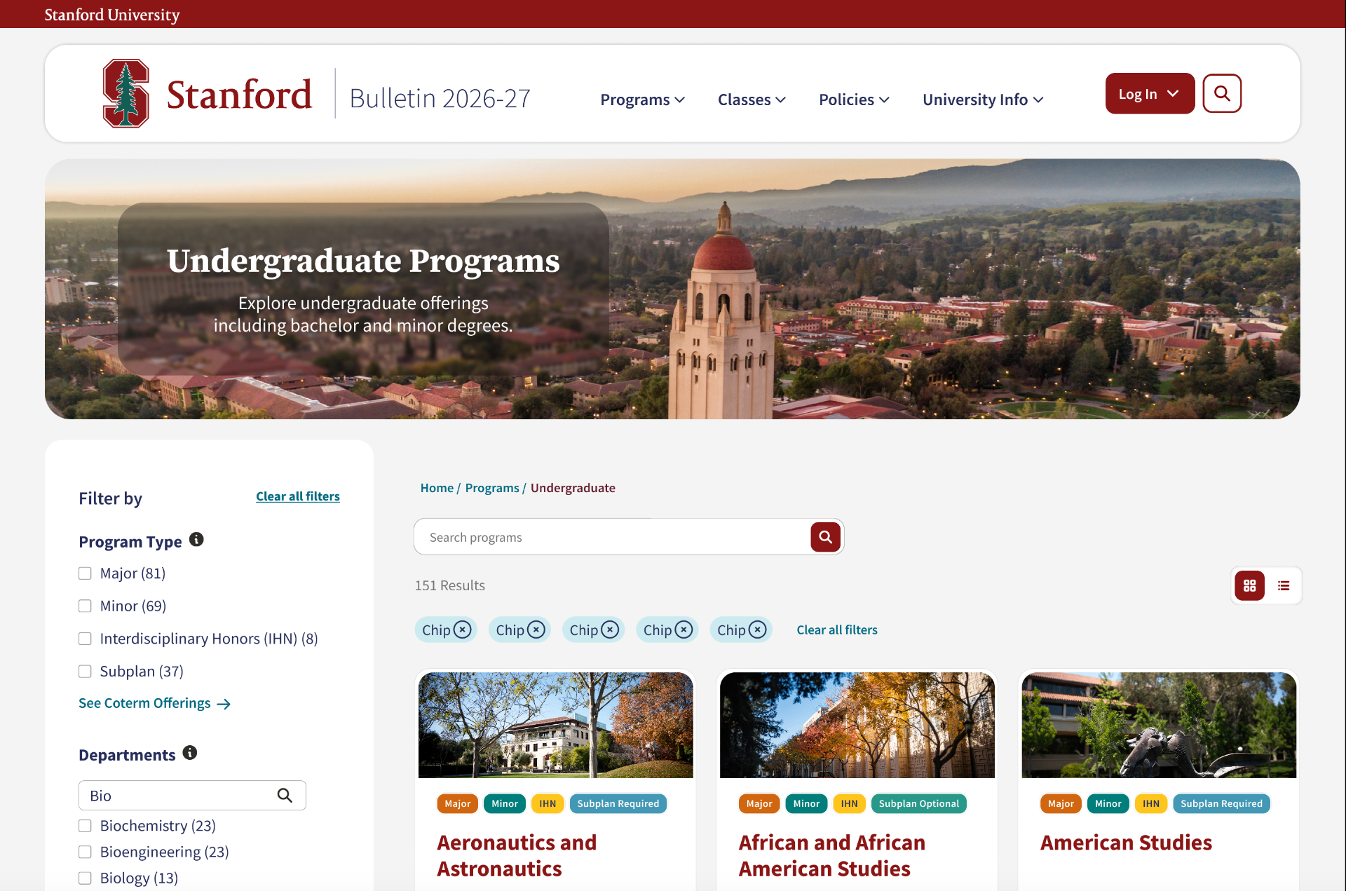
The redesign answers each of these directly. The Bite is a program card with a field-specific photo, colored type tags (Major, Minor, IHN, Subplan — including subplans the old system never surfaced), letting students filter 349 programs to a relevant shortlist in seconds. The Snack previews degree type, school, unit requirements, and a short description without navigating away. The Meal is the full detail page with persistent left-side navigation and a right-side jump-to menu, and — the hardest problem in the entire Bulletin — a requirements structure that finally makes top-level requirements visually distinct from nested sub-requirements, resolved through the testing process described above. Programs is fully designed and currently in usability testing.
Policies
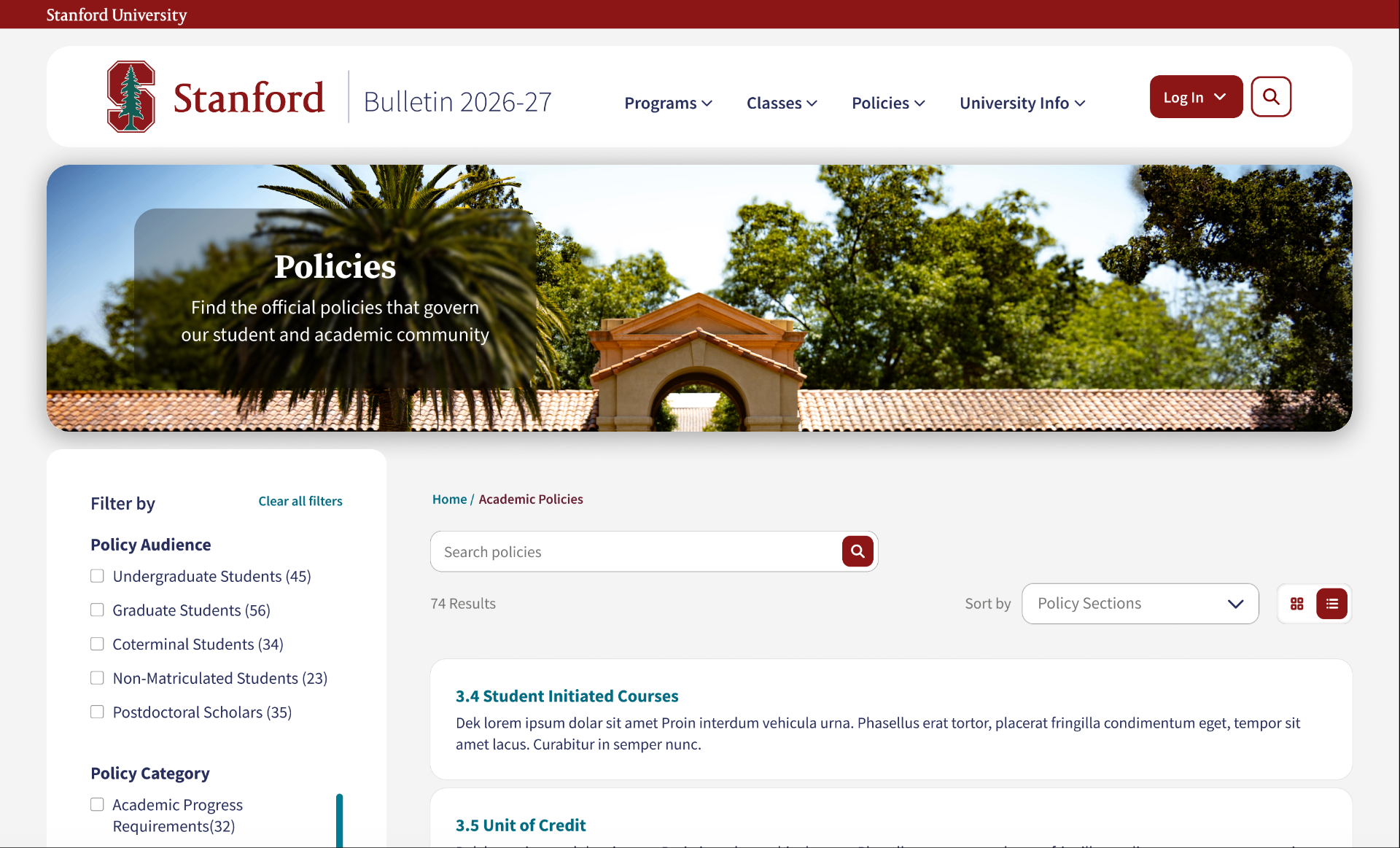
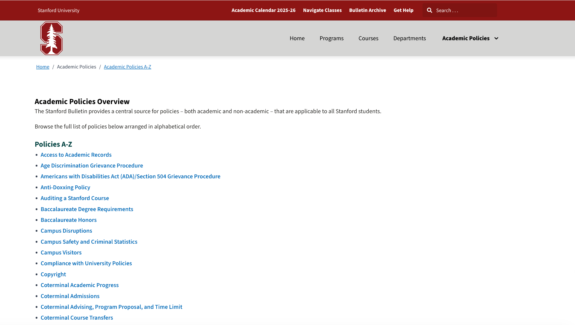
The old Policies page was an alphabetical A–Z link list, with no categorization or search, and no way to know what a policy covered before clicking. The design direction I set: organize by student context — the situations students actually encounter — rather than by the official name of a policy they don't yet know. The Accordion Suite component handles the layered, nested nature of policy content while keeping it readable. Currently under development with SWS leading the build, under my design direction and review.
Departments
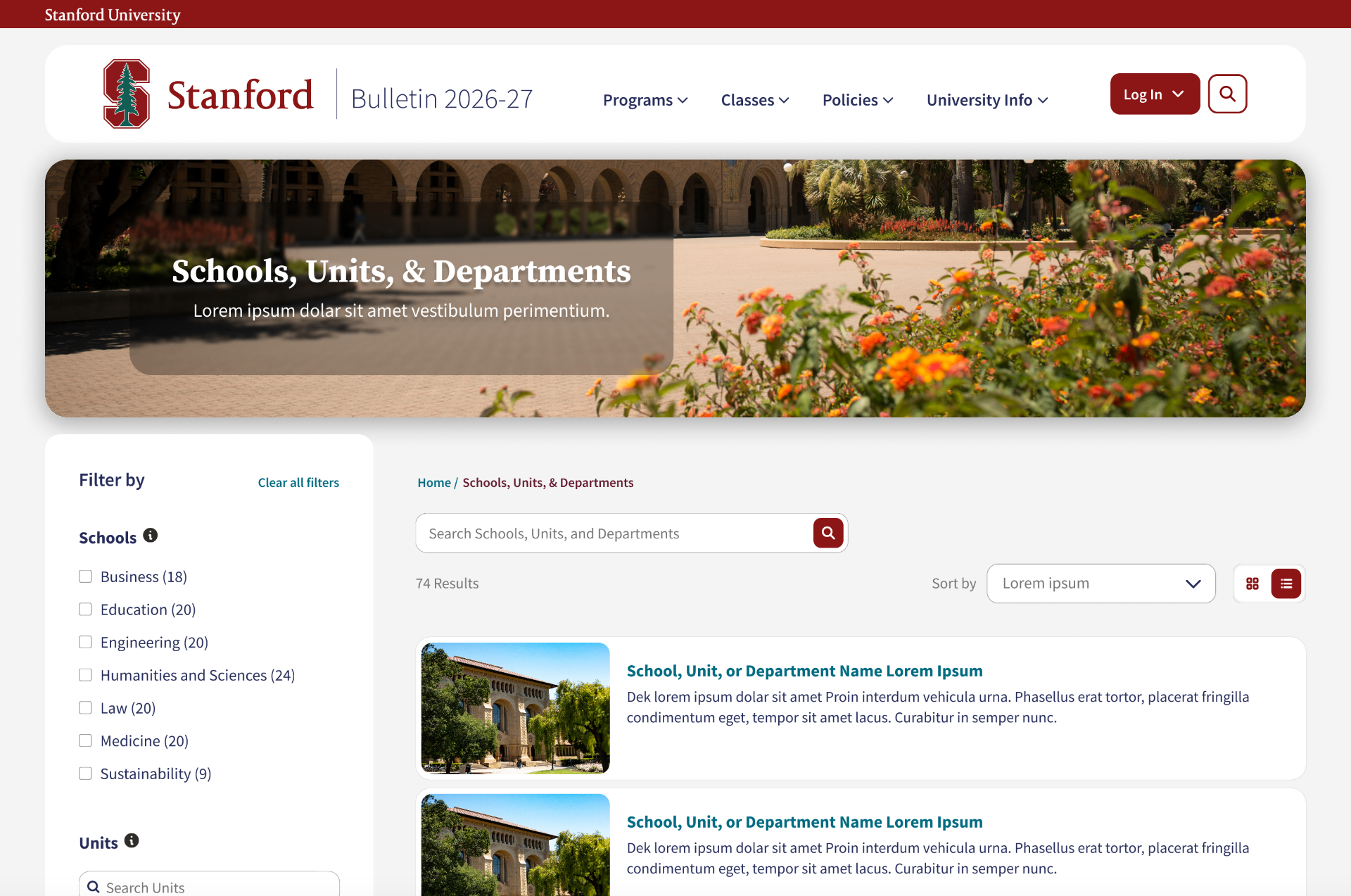
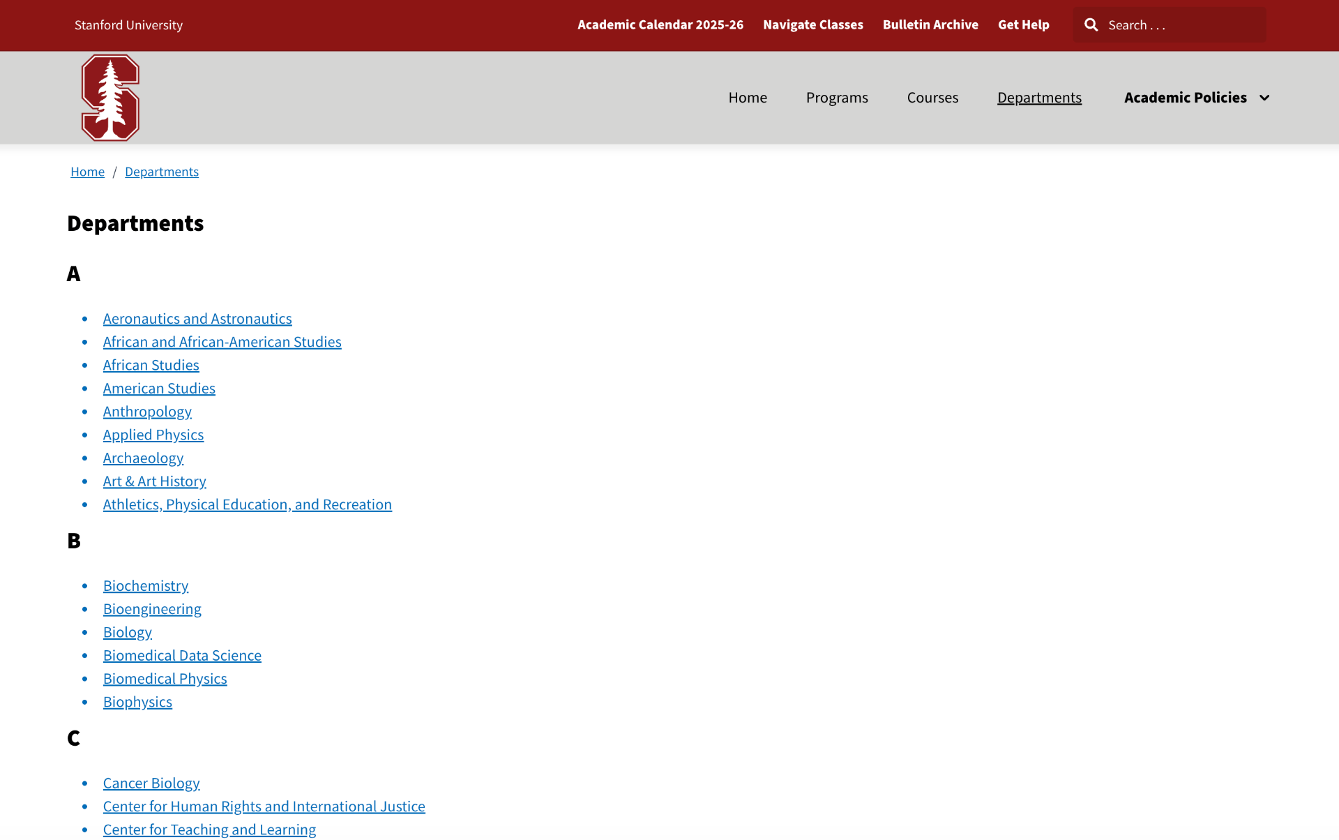
The old Departments page was a plain alphabetical list — department names as links, no context, no structure. The redesign moves to the same card-based layout with left-side filters used in Programs — deliberately, so a student who's learned to navigate Programs immediately understands Departments. The open design challenge is serving departments that range from small humanities programs to large engineering schools within one component system. Currently in design, with SWS leading the build under my direction.
Takeaway & Reflection
Four fundamentally different users needed the same platform to be true for all of them at once. A prospective student wants to scan fast and move on. An advisor wants one specific answer under time pressure. Faculty need the record to be exact enough to stand as official. Satisfying “fast,” “specific,” and “exact” simultaneously took more than a good layout — it took a system. Bite/Snack/Meal is the product of that pressure: a way of treating those three needs as three depths of the same information, rather than three competing demands on one screen.
Getting to production added a different kind of difficulty. Retiring three separate, decades-old tools (GAP, Explore Courses, Explore Majors) meant building one system precise enough to survive contact with 15,875 real courses and 349 real programs, each carrying its own edge cases. The Requirements page took multiple testing rounds because a design that looks resolved in a mockup and a design that holds up across every degree Stanford offers are tested very differently — and I only fully understood that gap once testing kept sending the design back.
Stakeholder collaboration compounded both of these. I own Courses and Programs end-to-end, but Policies and Departments are built by Stanford Web Services under my direction, so the design system had to be legible and enforceable by a team executing it without me in the room. Setting a standard I could hand off cleanly, and trust to hold without my daily involvement, was the skill I grew the most on this project.
What this project sharpened for me: “serving everyone” is a systems problem with a real, testable answer, and leading design across a mixed team — some of whom report to other departments entirely — requires the same rigor as leading design across a single Figma file, just applied differently.