Navigate Classes
Reimagining Class Search for Stanford Students
A mobile-first replacement for Explore Courses, Stanford's official class search tool. Students had built third-party replacements around it. Navigate Classes now serves students, staff, and faculty across Stanford.
I joined the UXDS team at the start of this project. Early low-fidelity wireframes existed, and the mandate was set: replace Explore Courses with a modern, student-centered tool. I designed the hi-fi prototype in Figma, ran two rounds of usability testing, synthesized the findings, and worked with the Stanford Registrar to ship a live product.
I had a personal stake in this problem before I had a professional one. As a master's student in Learning Design and Technology at Stanford, I used the old system for years and felt its friction directly. That experience shaped how I read the research from day one.
UX Researcher and Designer
UXDS, Stanford University
Stanford Registrar
Explore Courses → Navigate Classes
The same class search task. Before and after.
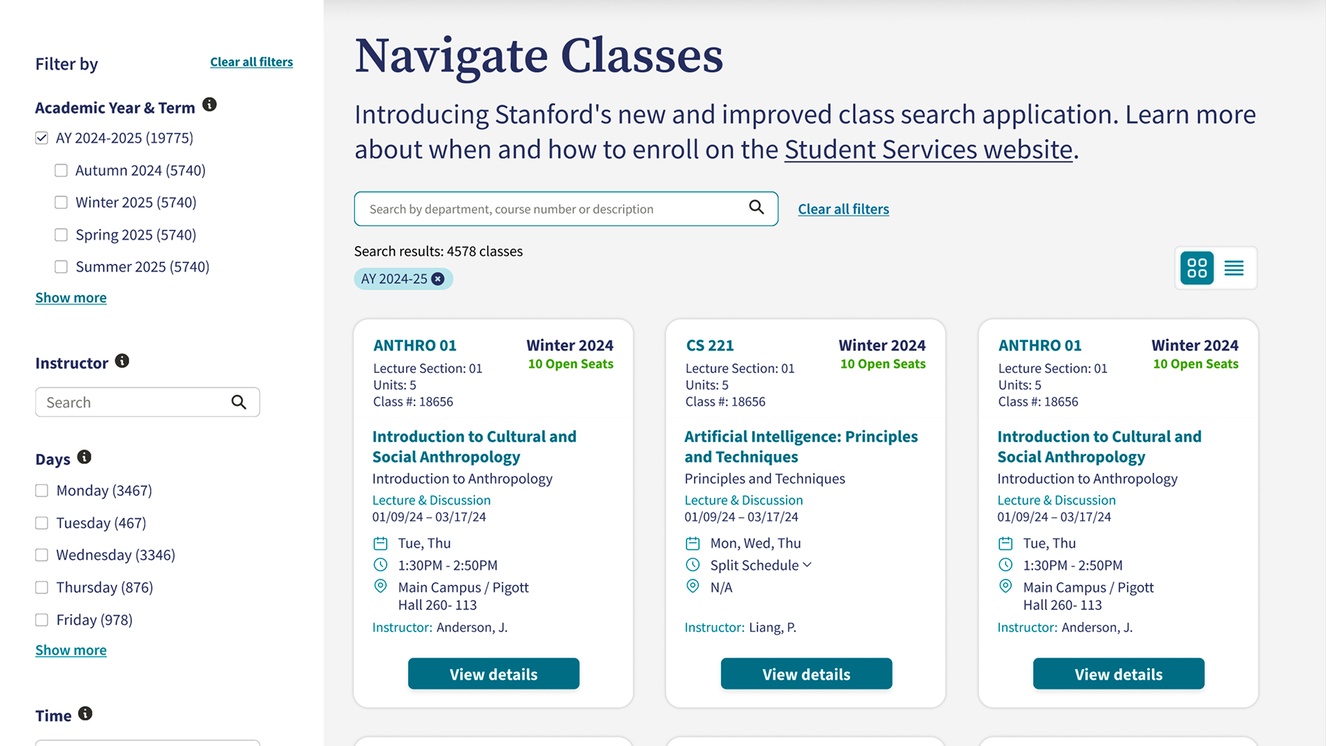
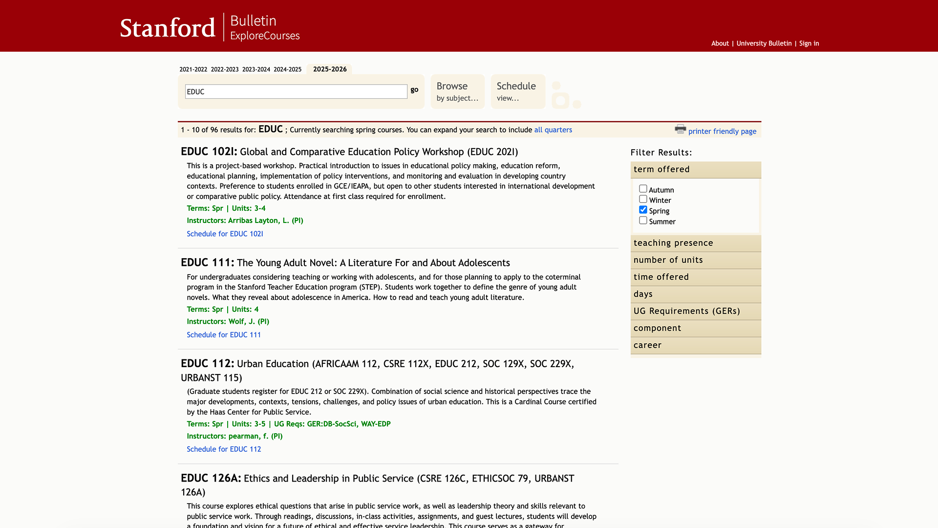
Explore Courses was Stanford's official class search tool — authoritative data, nearly unusable interface. Navigate Classes replaced it with a mobile-first, student-centered experience built around how students actually plan their academics.
Challenge
How do you replace a class search tool that holds the only authoritative data on Stanford's courses, when the real problem sits in the whole experience of planning a quarter around it, not in the data itself?
Research
Stanford's Registrar's Office had commissioned a discovery project on Explore Courses in 2021, before this design work began. Twelve student interviews, four workshops with forty students, five student personas, and benchmarking across seven peer institutions. The research documented why the system was failing students, and the findings ran deeper than a UI problem.
Students used Explore Courses because it held the only authoritative data. They did not rely on it to make decisions. Third-party tools like Carta and Oncourse existed because Explore Courses delivered valuable data in a way that made real exploration close to impossible.
The research mapped the fragmentation directly: a student-built spreadsheet planner, department websites for major requirements, two separate class search tools, a degree progress report, unofficial transcript data, and two enrollment systems, none integrated with each other. A single class decision could touch every one of them.
The research also named who this fragmentation hurt most. First-generation and low-income students, without upperclassmen networks or family familiarity with university systems, carried the heaviest cost. One student put it plainly: "I wanted to explore but in the beginning it was not fun. I was overwhelmed. There were too many choices."
That finding set specific design decisions in motion. A student without a peer network to ask about a professor gets that answer from an instructor profile page. A student without a clear starting department can search by interest or topic instead. A student without an advisor connection can see degree requirements and grading basis directly in the interface. A student planning between classes gets a mobile experience built as a primary interaction, not an afterthought.
Synthesizing this research reframed the problem. Class planning at Stanford is not a single event. Students explore for weeks before an enrollment window opens, move fast when it does, and keep adjusting for weeks after. The old system was built as a transaction: search, then leave. Students experience it as an ongoing relationship with their schedule across a full quarter. The redesign had to support a student at every point on that arc, not just the moment of search.

Eliot
"Happily over-committed"
Values
- Personal connections and networks
- Make a difference helping people
- Be organized, planned, and accomplished
Motivations
Goals
- Soak in advice from Stanford network
- Well-rounded education while helping kids with trauma
- Take advantage of research opportunities
Bio
An ambitious junior balancing pre-med requirements with a passion for ethics, drawing on every mentor and advisor available.
I know what I want to do and I am taking full advantage of all the relationships and advice I can get.
Frustrations
- Wishes more time for electives like kayaking and paddleboard
- Align WAYS and major requirements
- Quarter system goes too fast
Academic Planning
Influences
Frequently Used Tools
Key features
Bite, Snack, Meal
Not every student comes to class discovery in the same state of mind. Some want a fast answer between classes. Others are settling in for a full planning session. Explore Courses treated every visit the same way, and it served none of them well.
Bite is the fastest interaction: a class card with name, units, time, location, instructor, and format. Enough to decide whether to keep scrolling. Snack goes one step deeper: description, grading basis, requirements, crosslisted options, and reserved seats, without leaving the browsing context. Most decisions happen here. Meal is the full picture: complete description, requisites, class preparation, an instructor profile linked to every class that instructor teaches, and full class information.
Every element on every screen was measured against this framework: what level of engagement does this belong to, and does it respect the student's time at that level.
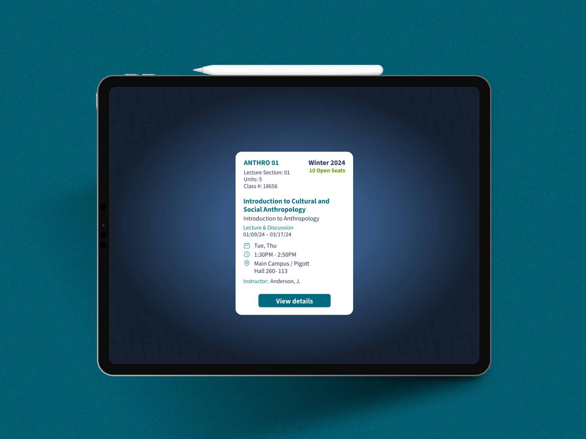
Bite view
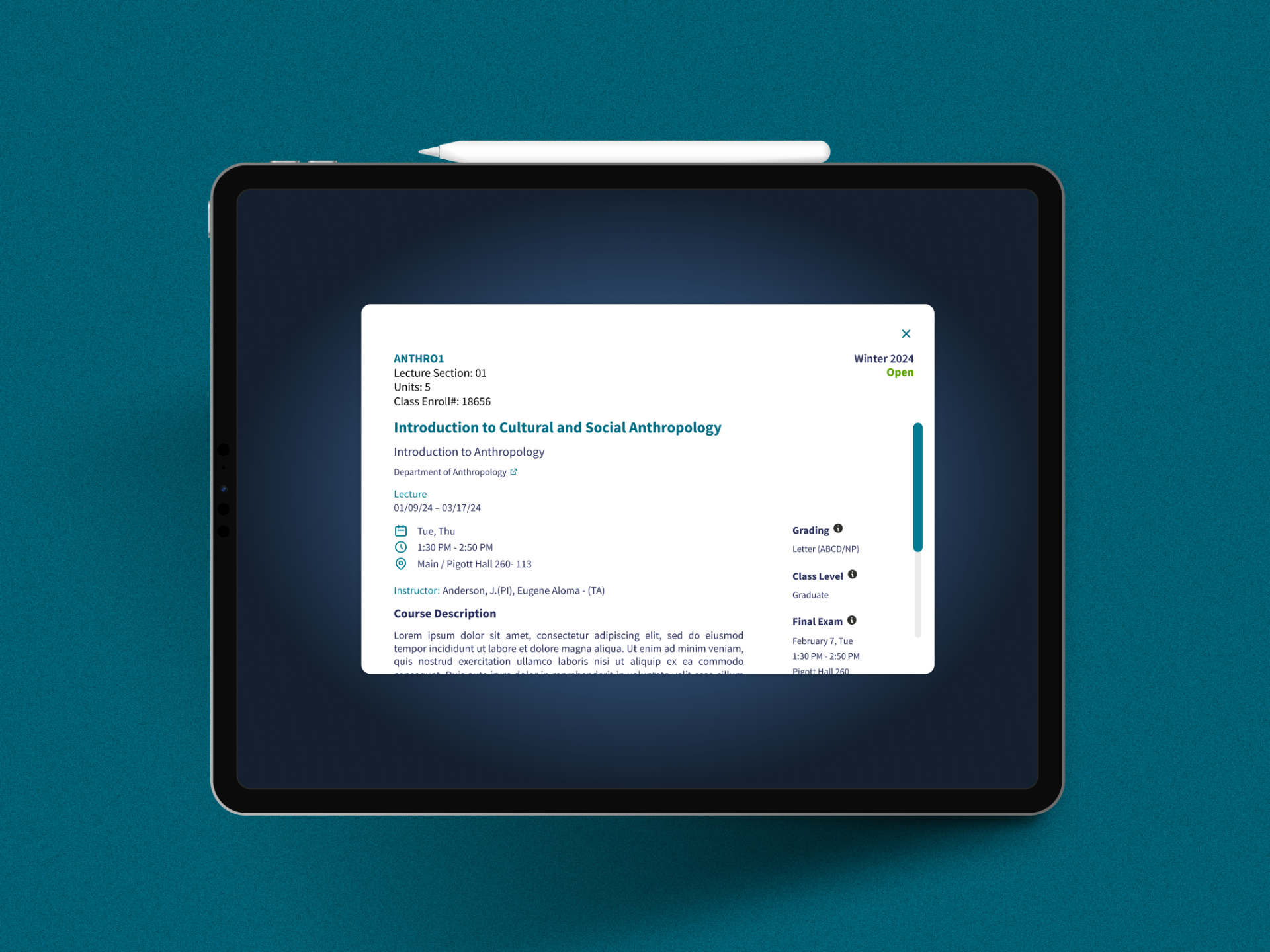
Snack view
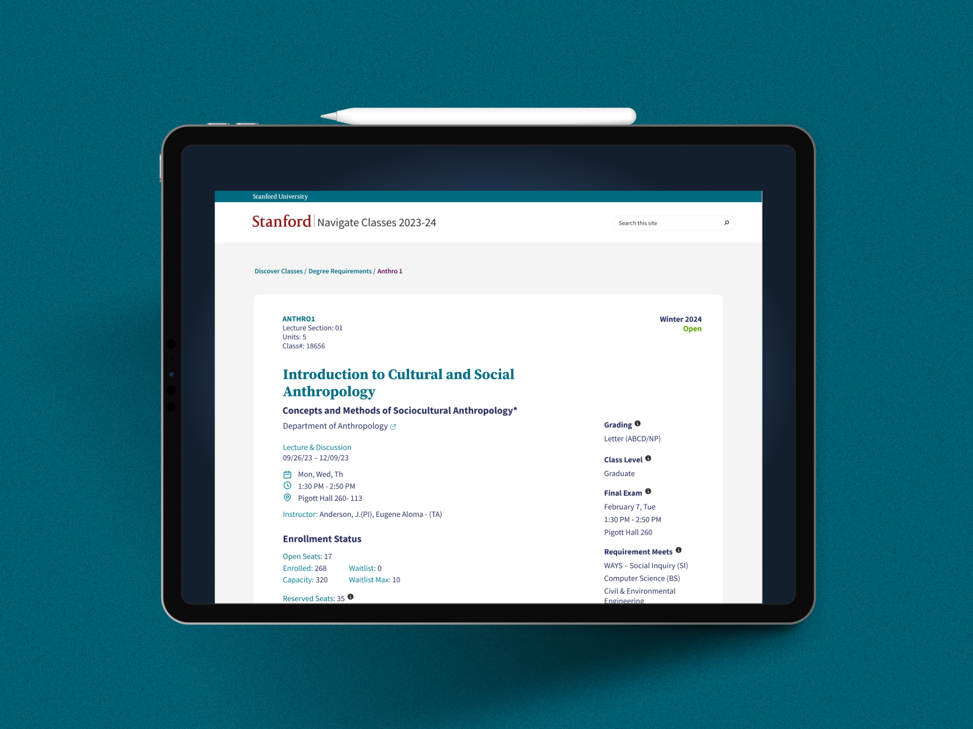
Meal page
Every element on every screen was evaluated against this framework: what level of engagement does this belong to, and does it respect the student's time at that level? It kept us from the creeping tendency to add more information to every layer just because we could.
Four Feature Pillars
Four pillars. Each a direct answer to what research told us.
Powerful Filtering
Gave students real control for the first time. The research found students were defaulting to safe, familiar classes — not because they lacked curiosity, but because the old tools gave them no reliable way to narrow Stanford's catalogue to what was actually relevant to them. Filtering by workload, time commitment, prerequisites completed, department, and degree requirements turned an overwhelming catalogue into a manageable shortlist.
Powerful Search Capabilities
Went far beyond keyword matching — designed to understand how students actually think about classes: by topic, by professor, by interest area — not just by class code. The research found students frequently relied on peers and upperclassmen to fill information gaps the tools couldn't. Search that works the way students think reduces that dependency.
Full Content Display
Addressed the most documented frustration in the research: students were visiting four to five separate sites — department pages, Carta, syllabi, peer networks — just to gather enough information to commit to a single class. We brought everything into one place so a student could go from discovery to informed decision without opening another tab.
Mobile-First Experience
Recognized where students actually do their research — between classes, on the go. Class browsing on the old platform was effectively unusable on a phone. We rebuilt the mobile experience from the ground up as a first-class interaction.
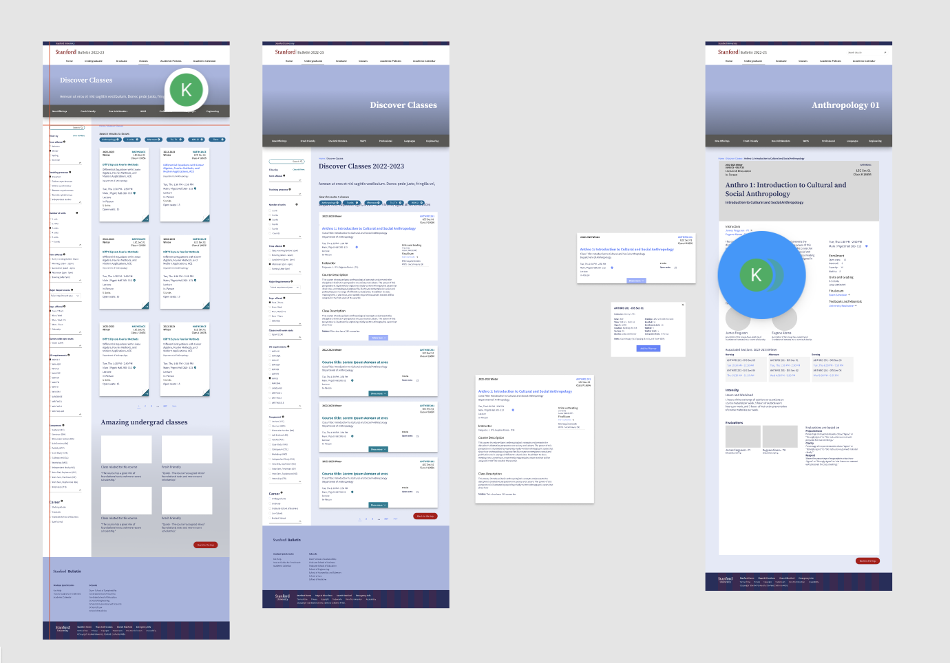
Early low-fi wireframes
What Testing Revealed
Discovery and search aren't separate behaviors. They're the same behavior at different moments of intent.
After completing the hi-fi prototype in Figma, I conducted usability testing with students online — each round with approximately 10 participants, split between graduate and undergraduate students and deliberately diverse across departments, academic years, and international backgrounds. Sessions were recorded and synthesized using Grain, whose AI-assisted analysis helped identify patterns across participants efficiently. I synthesized all findings into a structured report and presented them to stakeholders across the project team. From there, the team discussed which feedback to act on, and I applied the agreed changes to the design before development handoff.
The critical findings from that first round were instructive. A number of students were unaware of the mega menu, meaning valuable features were going unused because the navigation didn't surface them clearly — identified and resolved before launch. A second finding was that some students wanted reviews and workload data from peers. This is a deliberate information architecture decision driven by authentication requirements: Navigate Classes is a public platform with no login, and surfacing personal or peer-generated data requires authenticated sessions. An authenticated version is on the roadmap for this year — the testing feedback confirmed its direction, not its absence.
The validation findings were equally clear. Students described the interface as "stress-free" — a direct contrast to the anxiety associated with older platforms. The mobile experience was praised as intuitive and well-structured, validating the mobile-first decision at the behavior level. Students who were infrequent users reported increased interest in adopting the platform regularly after a single session.
The most significant structural evolution also came from this round. We'd initially designed recommendations as a separate "For You" section. Students liked it in isolation but kept bouncing between it and the main search view. The insight was simple: discovery and search aren't separate behaviors — they're the same behavior at different moments of intent. We merged both into a unified interface, with recommendations surfacing inline within search results. The logic became invisible infrastructure — present and useful, never demanding its own stage.
Once the platform went live, I ran a second round of usability testing with students on the live product. This ensured findings reflected not just designed intent but built reality — how the product actually behaved under real conditions. Further refinements were applied based on that round and stakeholder discussion.
Feedback doesn't stop at launch. Navigate Classes has an embedded feedback and ticket form that functions as a continuous discovery mechanism — a live channel that constantly surfaces what students are experiencing in the platform. That ongoing signal directly informs what gets prioritized — and this year, the team will be working on new features and building out the authenticated version that will unlock personalized functionality students have been asking for: saved classes, workload insights, peer reviews, and degree progress mapping.
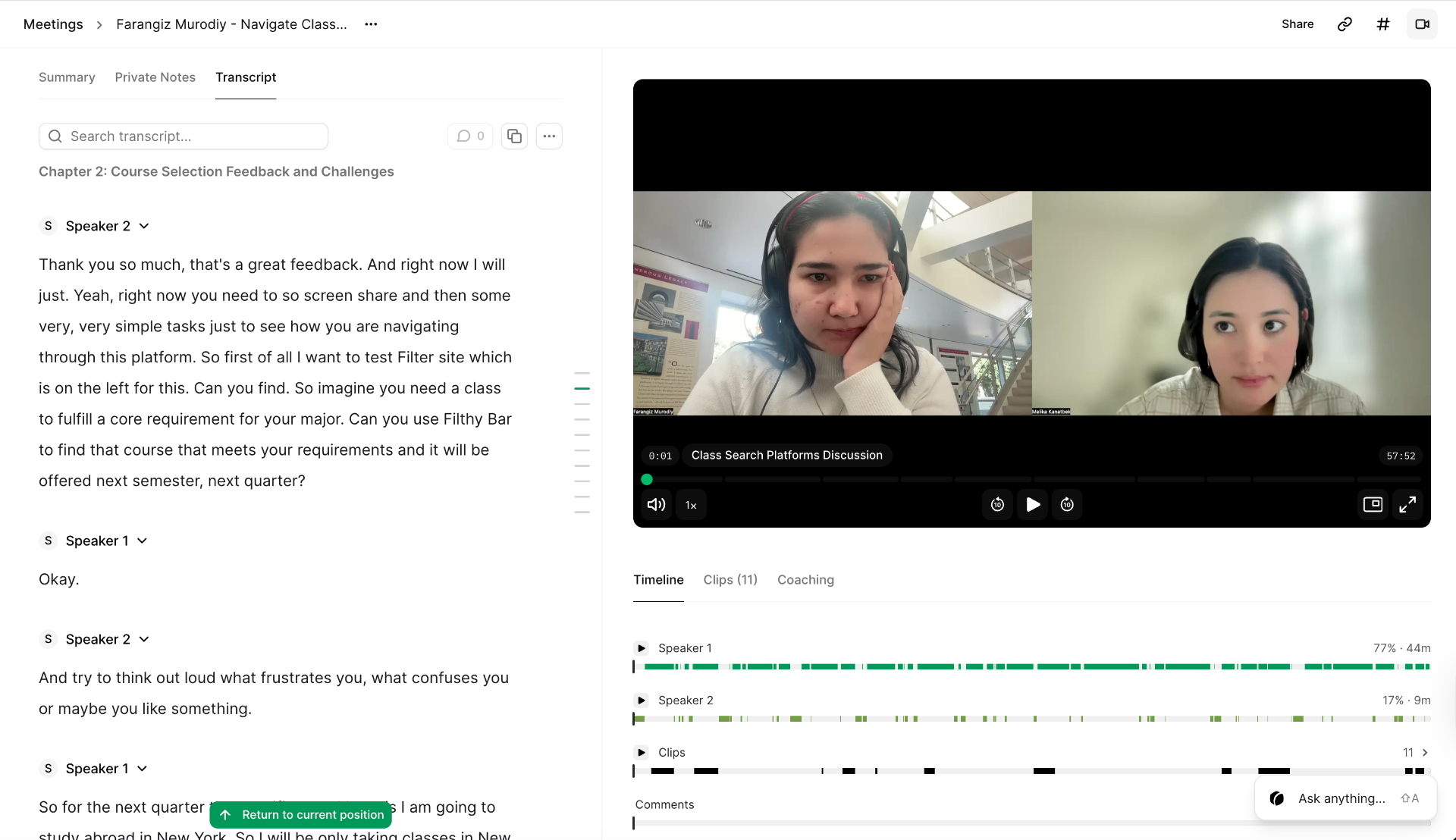
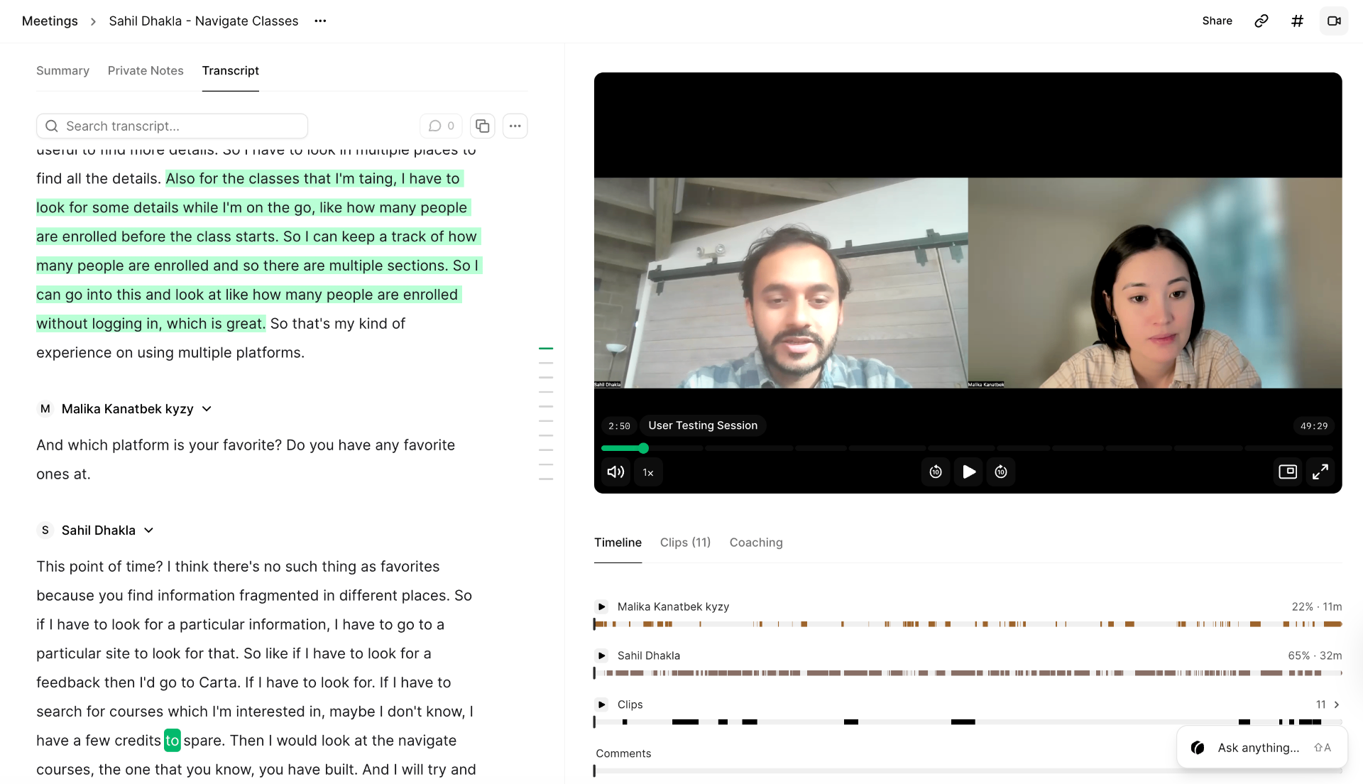
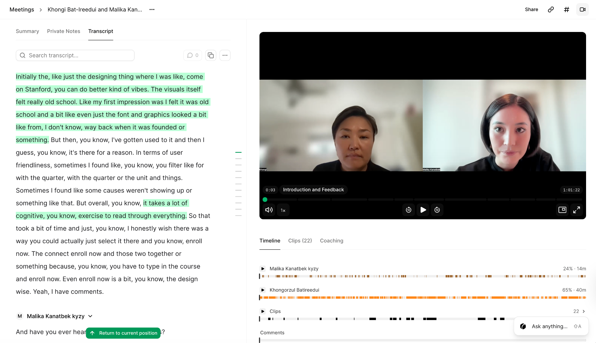
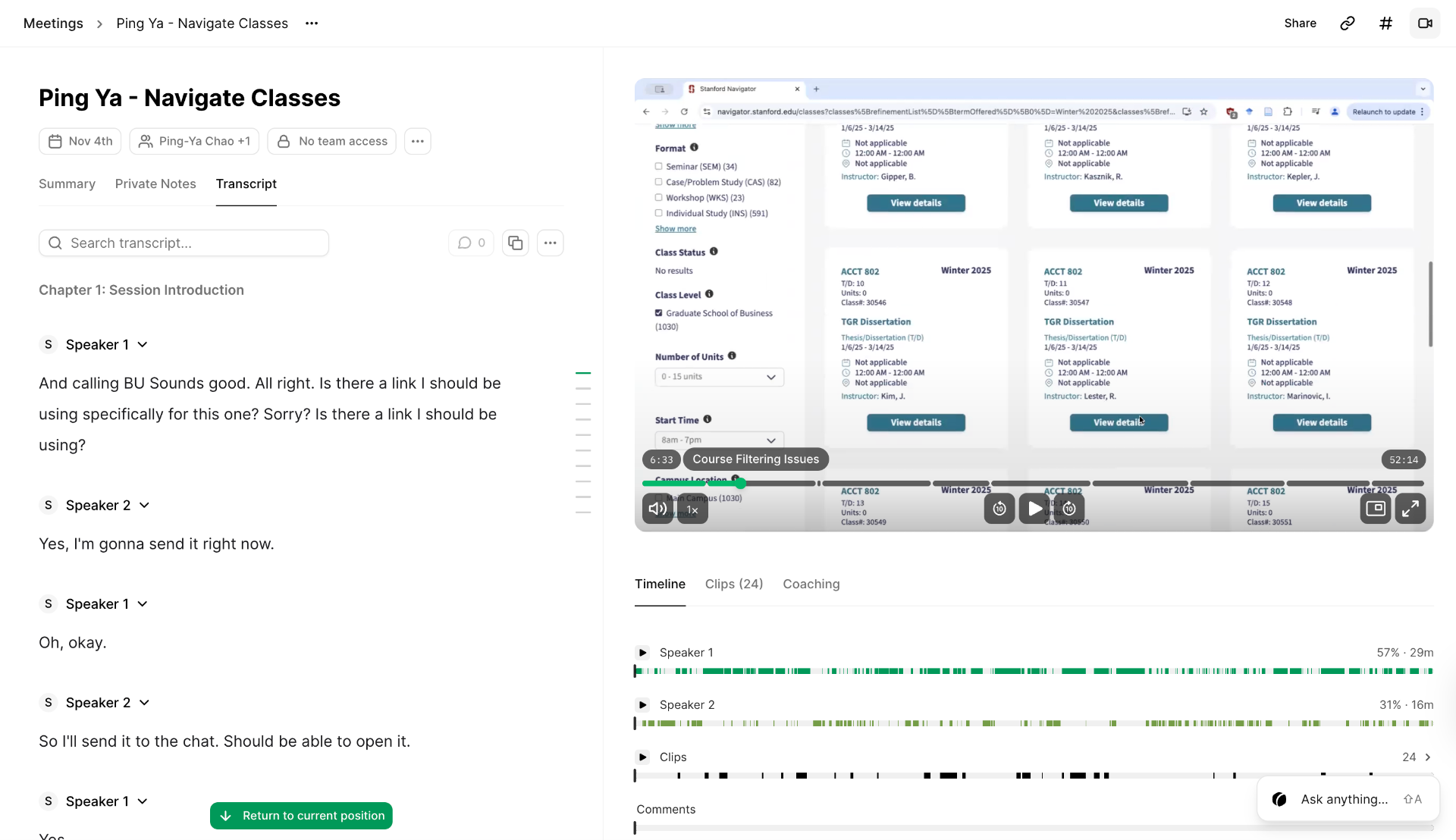
User testing of Navigate Classes
Impact
It shipped. And the entire Stanford community is using it.
The numbers are clear. In a single week, Navigate Classes recorded 336,000 views and 9,300 active users — both up over 40% from the previous period. The Class Details page alone saw 112,000 views growing at 115.6% — students drilling deep into class information inside the platform rather than leaving for external sources, exactly the behavior Full Content Display was designed to produce. A traffic spike on March 5th aligned with a Stanford enrollment window opening, with users accessing from the US, France, Vietnam, India, the UK, China, and Italy.
These numbers carry additional weight given the context. At the time of testing in spring 2025, Explore Courses was still live in parallel and many students simply didn't know Navigate Classes existed. Awareness — not quality — was the primary adoption barrier. Growing at 40%+ while competing with a deeply habituated institutional tool, with minimal awareness campaigns, is meaningful performance.
The qualitative data reinforces this. Students rated consolidated class information as the platform's most valued aspect, directly validating the core hypothesis. The embedded feedback form keeps that signal live — and what it's pointing toward is already in motion: new features shipping this year, and an authenticated version that will make Navigate Classes not just a place to find classes, but a platform that knows who you are and what you're working toward.
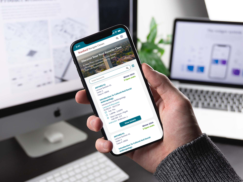
Mobile-first design